
Posts from the ‘David Hicks’ Category
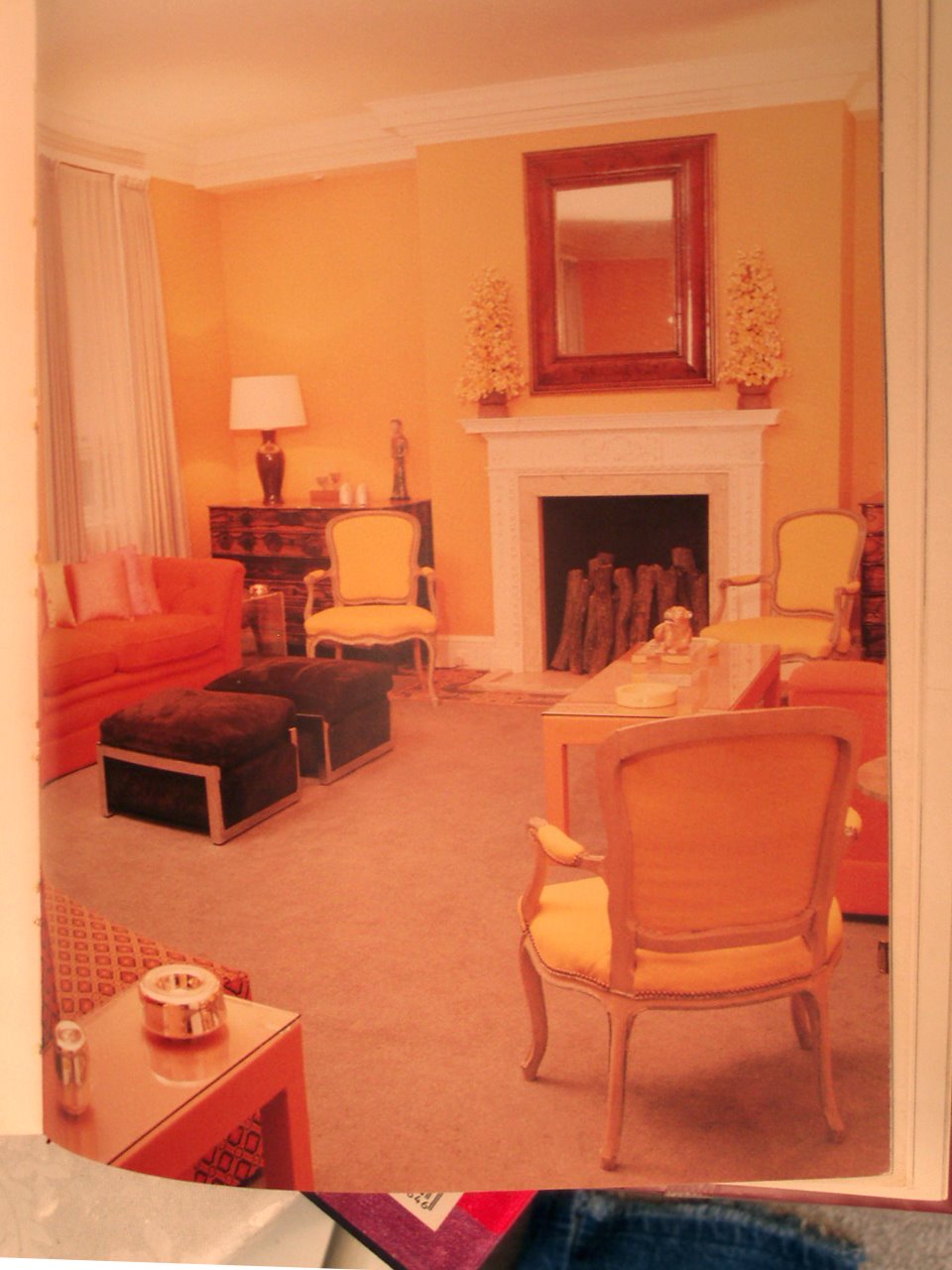
David Hicks Style and Design, 1987. “In this well-proportioned living room, two generous sofas to the left and right of the fireplace work well flanked by three elbow chairs. Opposite the fireplace, a large armless sofa provides a third seating area.”
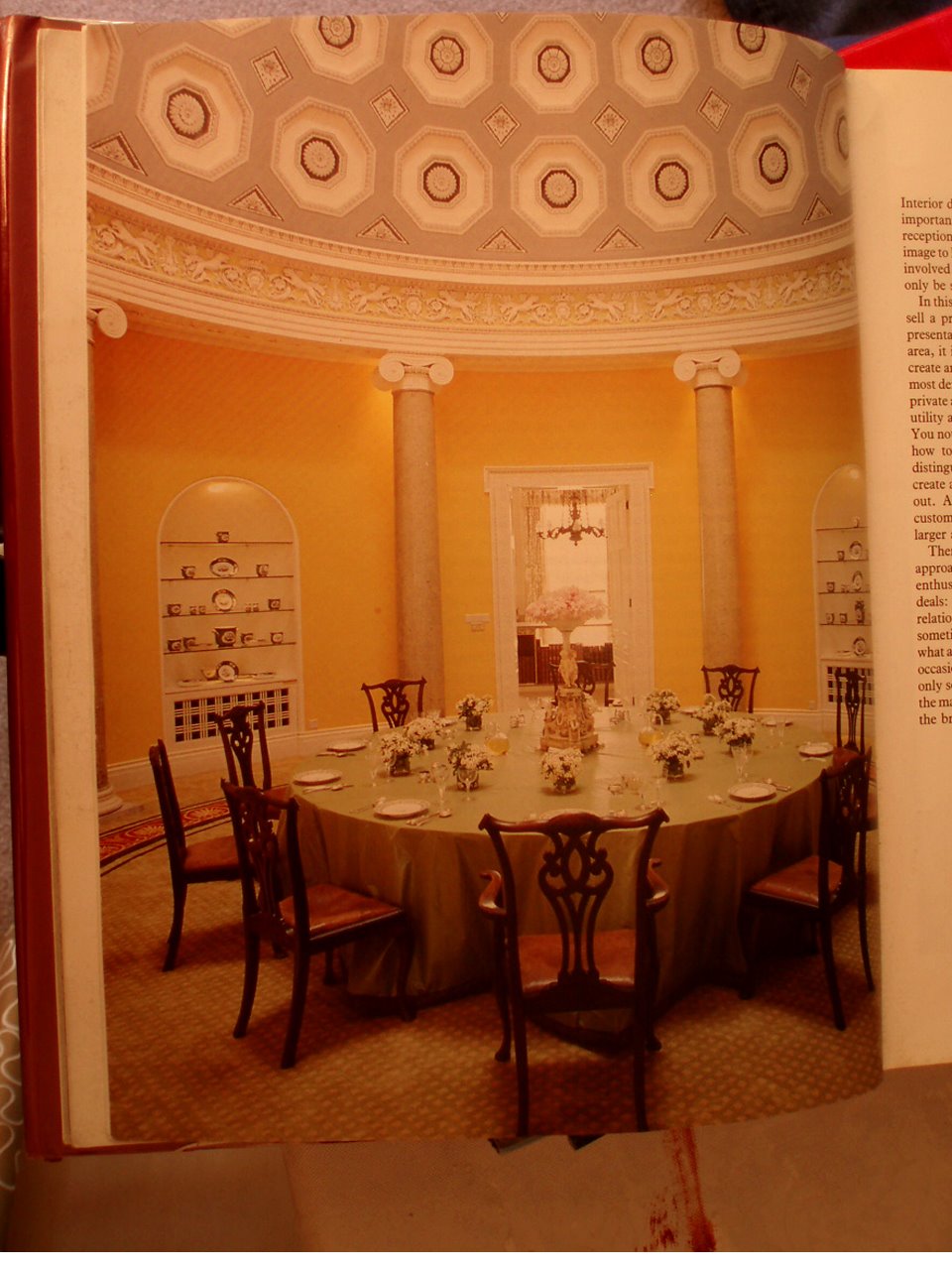
 David Hicks: “The Duke & Duchess of Abercorn’s rotunda in Northern Ireland. Lit by a skylight, it has a magnificent coffered ceiling which I painted in three tones of grey. The background of the frieze was painted lettuce green to complement the scagliola columns. The circular carpet, designed to my specifications was made in the Far East.”
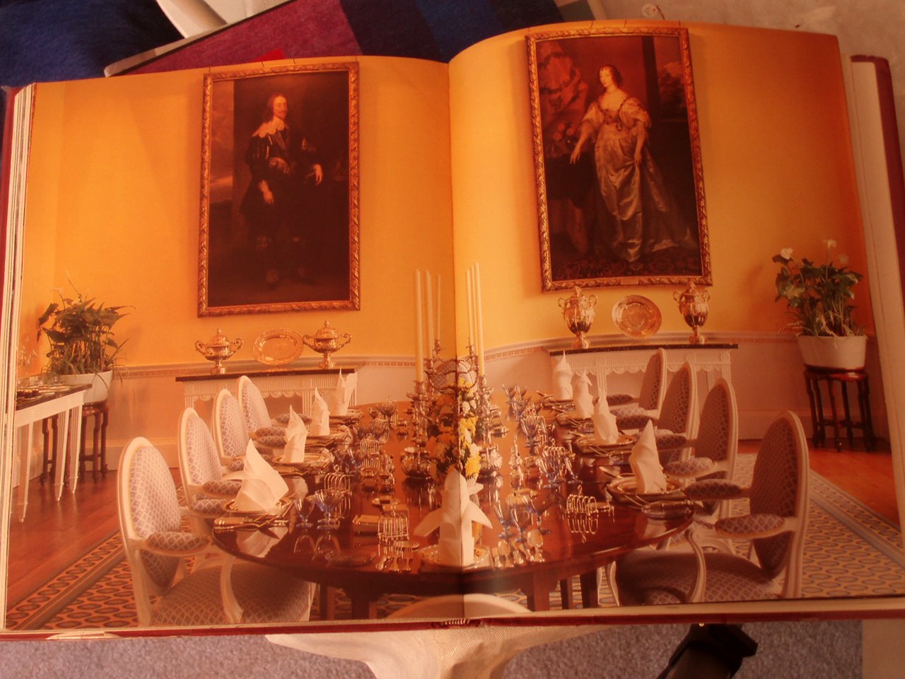
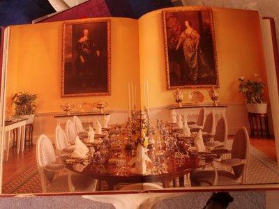 David Hicks: “The magnificent dining room at Broadlands has four full-length Van Dyck portraits. For my nephew and niece, I suggested a color scheme of daffodil yellow for the walls and deep Naples yellow for the background of the frieze, the details of which were then picked out in pure white.”


 David Hicks: “The Duke & Duchess of Abercorn’s rotunda in Northern Ireland. Lit by a skylight, it has a magnificent coffered ceiling which I painted in three tones of grey. The background of the frieze was painted lettuce green to complement the scagliola columns. The circular carpet, designed to my specifications was made in the Far East.”
 David Hicks: “The magnificent dining room at Broadlands has four full-length Van Dyck portraits. For my nephew and niece, I suggested a color scheme of daffodil yellow for the walls and deep Naples yellow for the background of the frieze, the details of which were then picked out in pure white.”
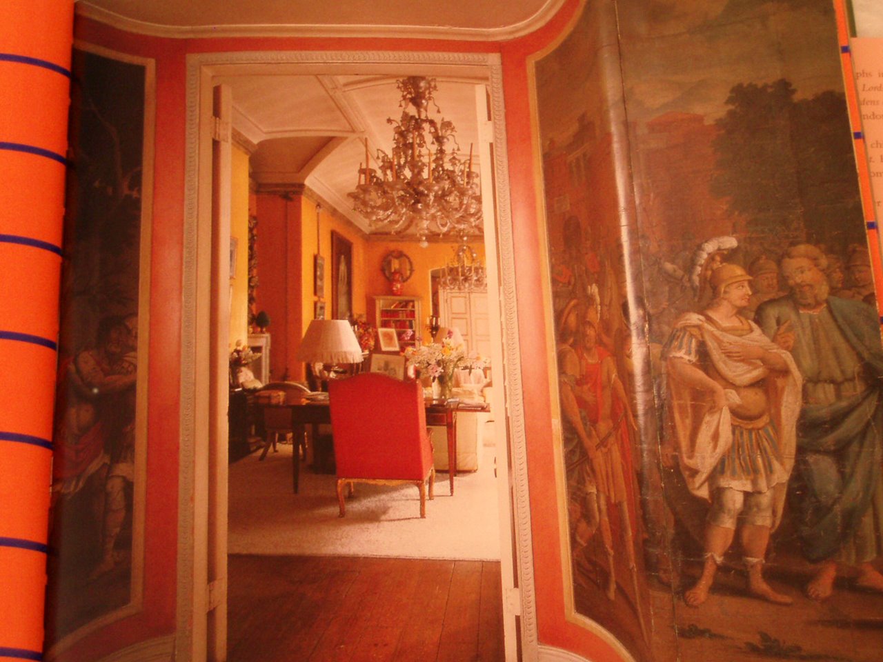
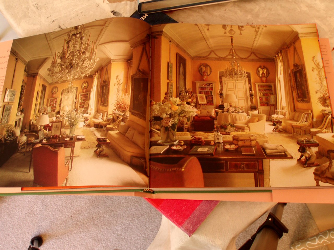
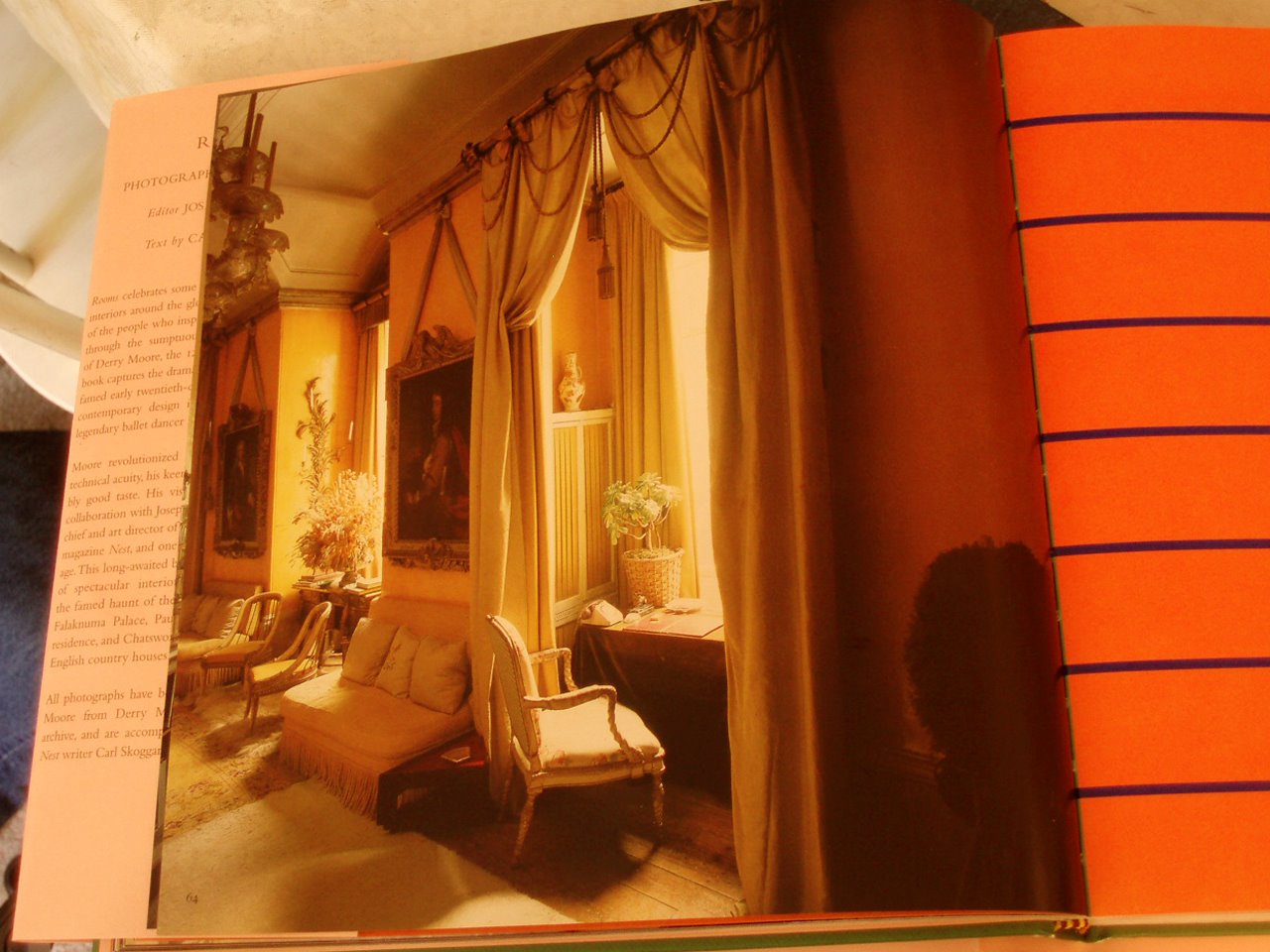
The bottom three photos are of the Yellow Room at Colefax and Fowler, a Nancy Lancaster personal finale. From Rooms Photographs by Derry Moore, 2006.
Yellow is a difficult color to do well. If you do want to do it, take a lesson from John Fowler– color and layers and layers of glaze. A grand space can not hurt.
Click on the photos for a better view.
1. 2.
2.
 3.
3.
 4.
4.
 5.
5.
 6.
6.
7.
8.
 9.
9.
10.
Of course, I’m not talking about Greene & Greene’s Gamble House nor even our ever ready eco friendly green. But just green, the color. I woke up this morning with the green beyond the chain link fence, in this case scaffolding, out my bedroom window. It still reflects the sunlight and of course a lovely counterpoint to the sky blue. I think Green Gartside of Scritti Politti once said that he took the name Green (to paraphrase) because he once woke up and that’s all he could see.
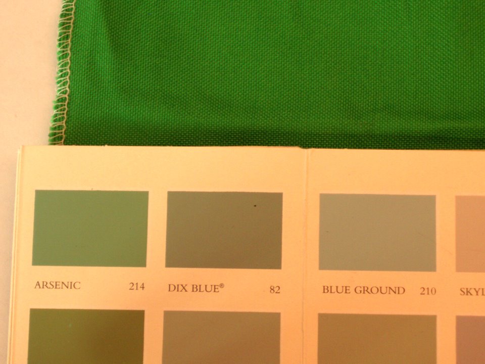
1. Farrow & Ball Arsenic my favorite color for the week–could be a fun play with Isaac Mizrahi’s “Extra silk” for S. Harris.
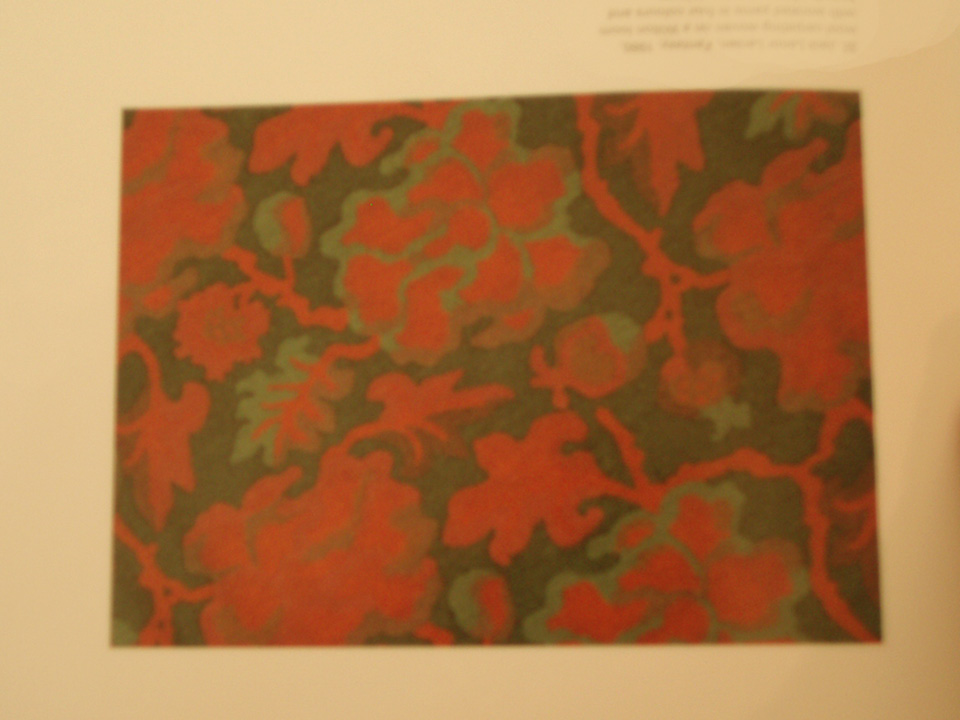
2. The dining room at Biddesden in Wiltshire. Lunch Green from from Farrow & Ball’s “Paint & Color in Decoration.” A must read for painting techniques & brushwork–something to study in our spray on orange peel on dry wall world.
3. Lutyens Green at Lindisfrane Castle, on Holy Island, also from P & C in D.
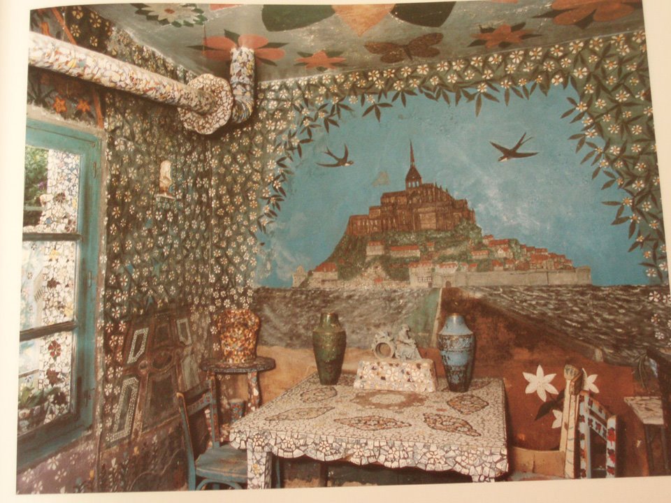
4. Teal greens in the mosaic work in Raymond Isidore’s, La Maison Pique-Assiette. Monsieur Isidore was for a while a caretaker of the Saint Cheron cemetery near Chartres. He began his life’s work embellishing his home and gardens in 1938 collecting bits of pottery and incorporating it into his interior–he completed it in 1962 then dying 2 years later.
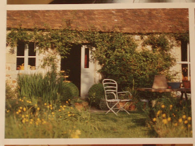
5. I rip things out, this inspiration for my future country garden.
4. Teal greens in the mosaic work in Raymond Isidore’s, La Maison Pique-Assiette. Monsieur Isidore was for a while a caretaker of the Saint Cheron cemetery near Chartres. He began his life’s work embellishing his home and gardens in 1938 collecting bits of pottery and incorporating it into his interior–he completed it in 1962 then dying 2 years later.
5. I rip things out, this inspiration for my future country garden.
6. Rip out inspiration: subtle green on the walls with a dense arrangment of furniture.
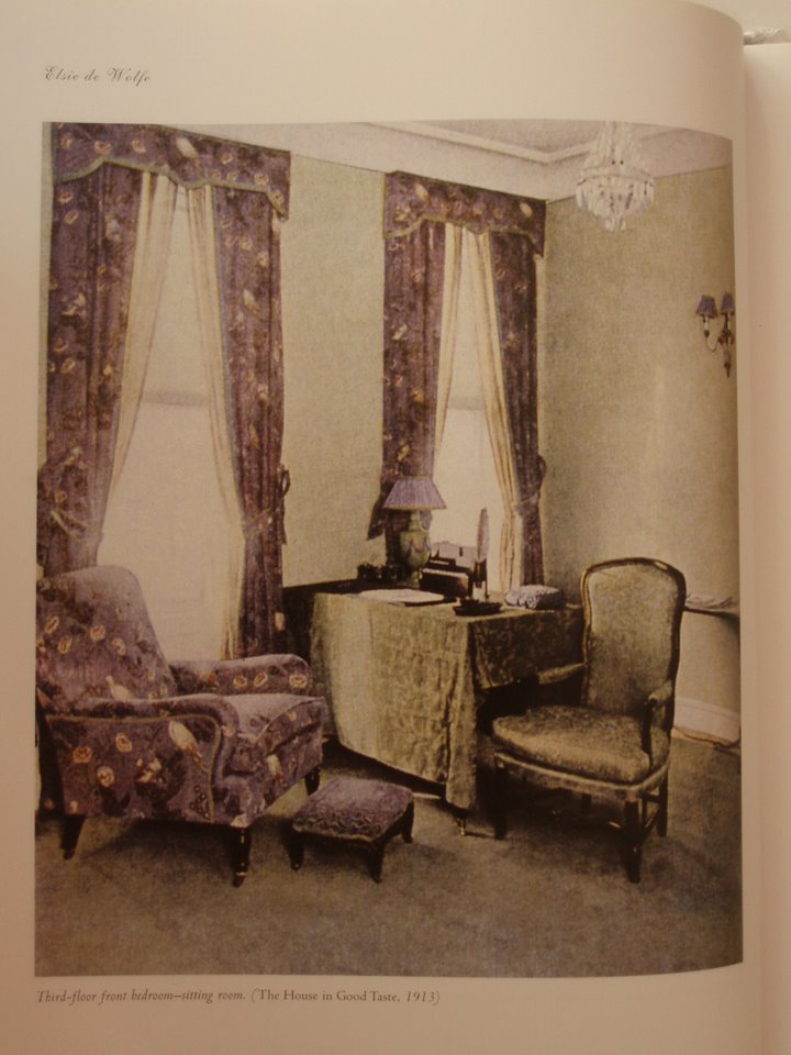
7. The ever present, Elsie de Wolfe and her pale blue green walls and mauve printed chintz upolstery & curtains in her 1910 showhouse, 131 East 71st Street, NYC.
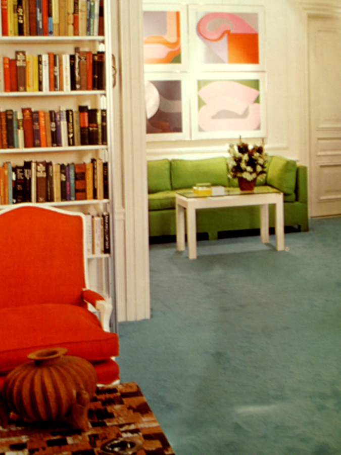
8. The brilliant green sofa in David Hicks’ Suite at the St. Regis.
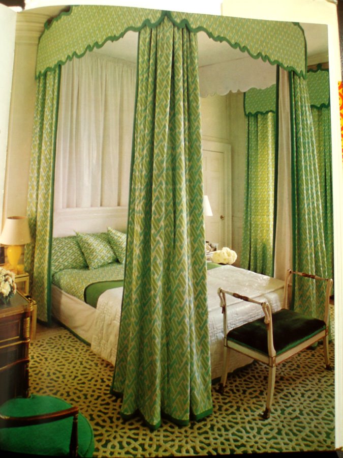
9. The crisp white glazed chintz inner drape a wonderful contrast to the outer printed greens and the slightly more blue green of the side chair.
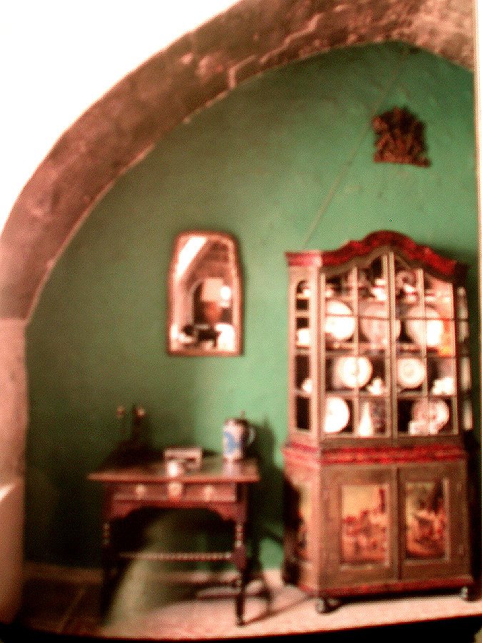
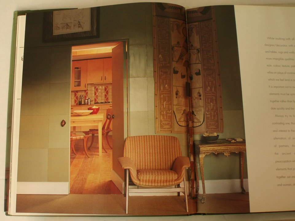
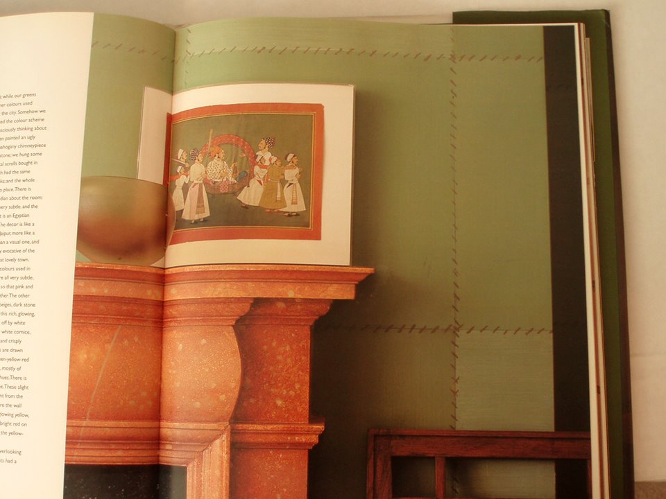
10. Ashley & Allegra Hicks’ country home. The green walls painted to look like sewn panels of leather. Further notice the floor in the kitchen which is a striped cherry and walnut veneer.

