
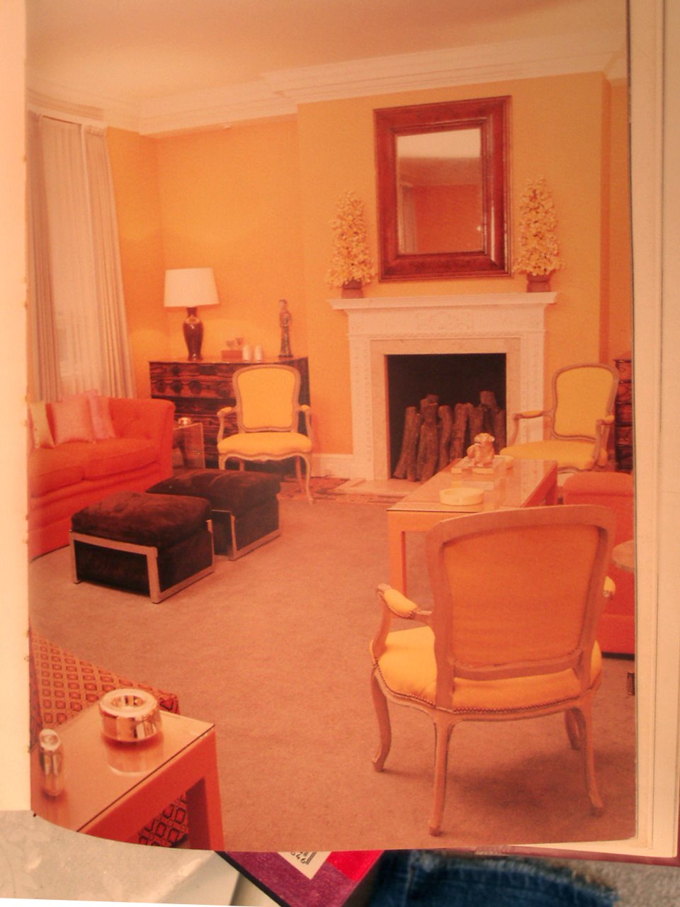
David Hicks Style and Design, 1987. “In this well-proportioned living room, two generous sofas to the left and right of the fireplace work well flanked by three elbow chairs. Opposite the fireplace, a large armless sofa provides a third seating area.”
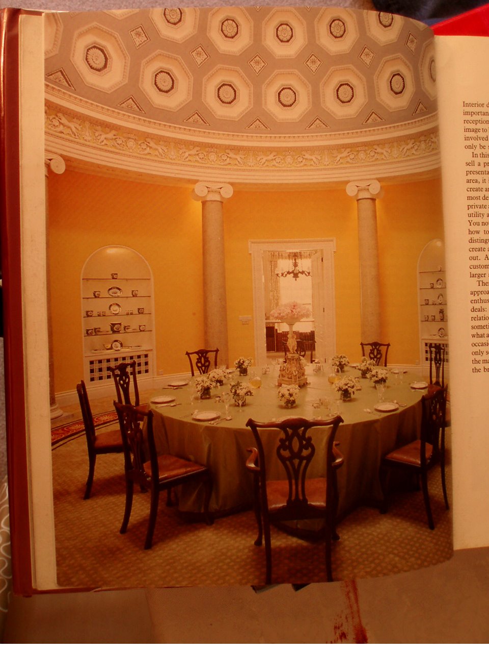
 David Hicks: “The Duke & Duchess of Abercorn’s rotunda in Northern Ireland. Lit by a skylight, it has a magnificent coffered ceiling which I painted in three tones of grey. The background of the frieze was painted lettuce green to complement the scagliola columns. The circular carpet, designed to my specifications was made in the Far East.”
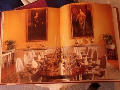 David Hicks: “The magnificent dining room at Broadlands has four full-length Van Dyck portraits. For my nephew and niece, I suggested a color scheme of daffodil yellow for the walls and deep Naples yellow for the background of the frieze, the details of which were then picked out in pure white.”


 David Hicks: “The Duke & Duchess of Abercorn’s rotunda in Northern Ireland. Lit by a skylight, it has a magnificent coffered ceiling which I painted in three tones of grey. The background of the frieze was painted lettuce green to complement the scagliola columns. The circular carpet, designed to my specifications was made in the Far East.”
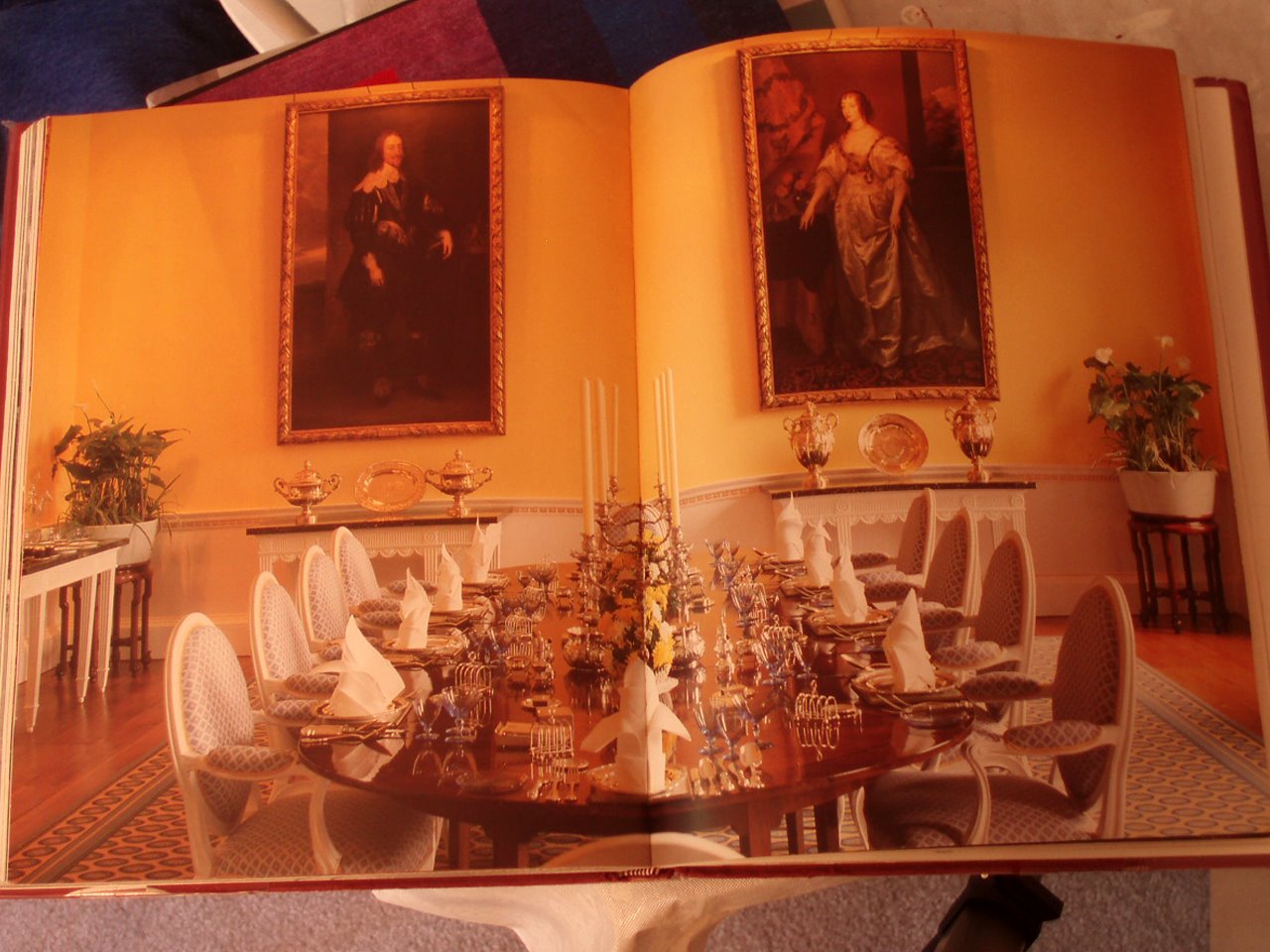 David Hicks: “The magnificent dining room at Broadlands has four full-length Van Dyck portraits. For my nephew and niece, I suggested a color scheme of daffodil yellow for the walls and deep Naples yellow for the background of the frieze, the details of which were then picked out in pure white.”
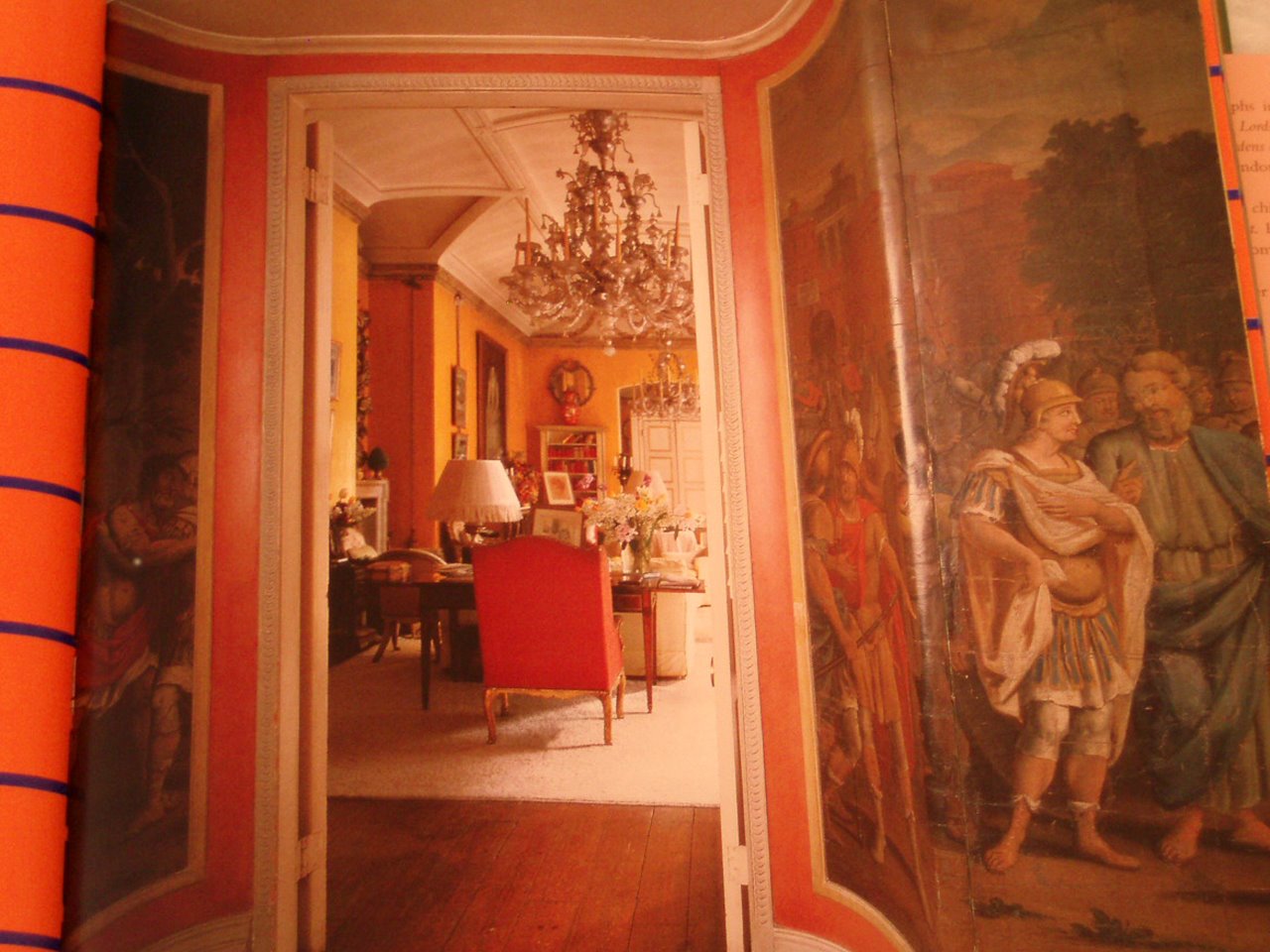
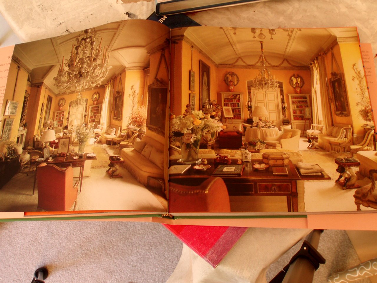
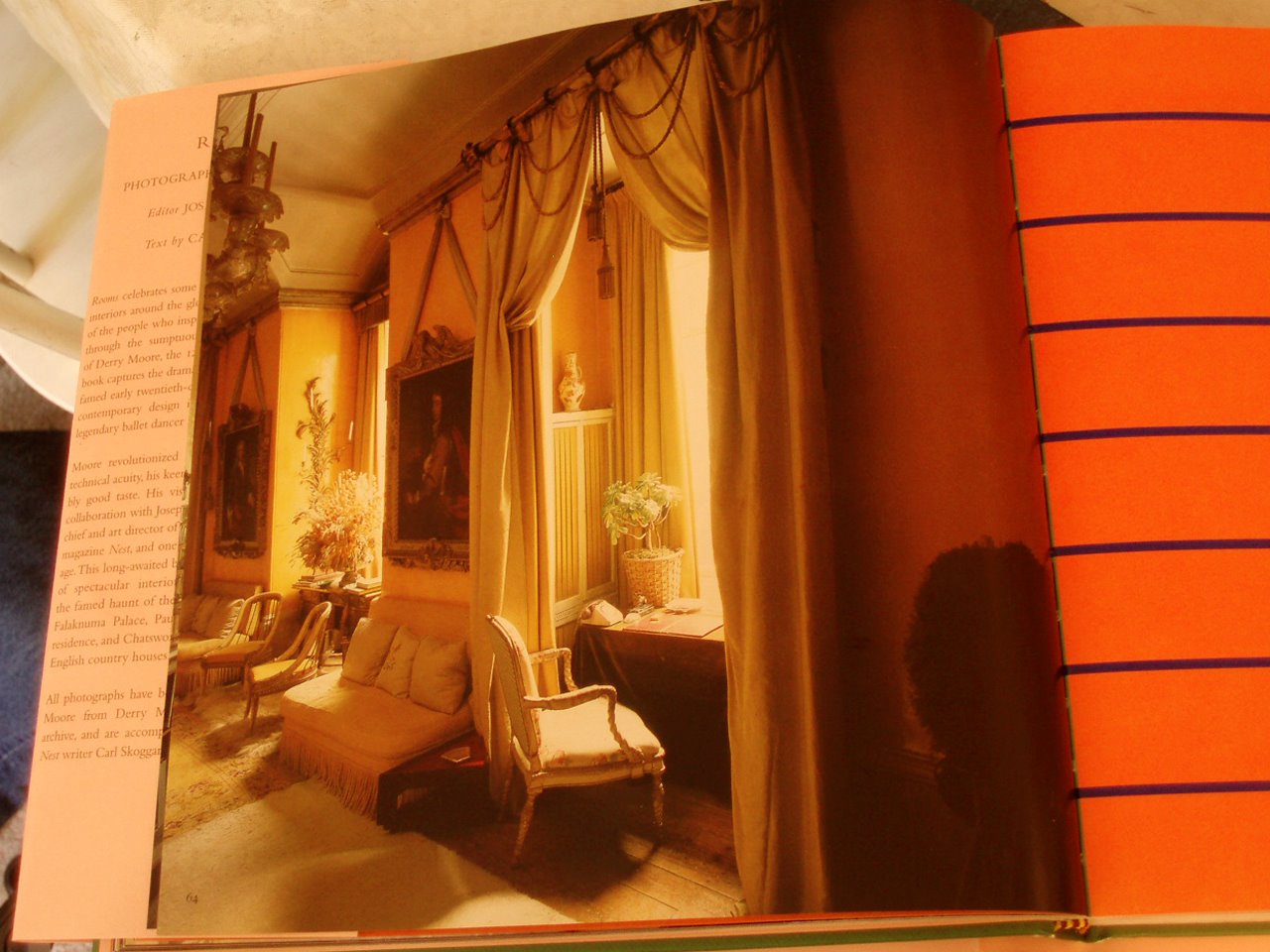
The bottom three photos are of the Yellow Room at Colefax and Fowler, a Nancy Lancaster personal finale. From Rooms Photographs by Derry Moore, 2006.
Yellow is a difficult color to do well. If you do want to do it, take a lesson from John Fowler– color and layers and layers of glaze. A grand space can not hurt.
Click on the photos for a better view.

No comments yet

