Posts from the ‘color’ Category
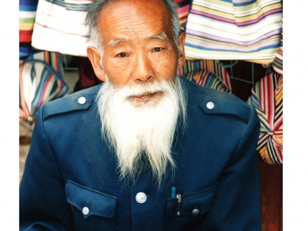
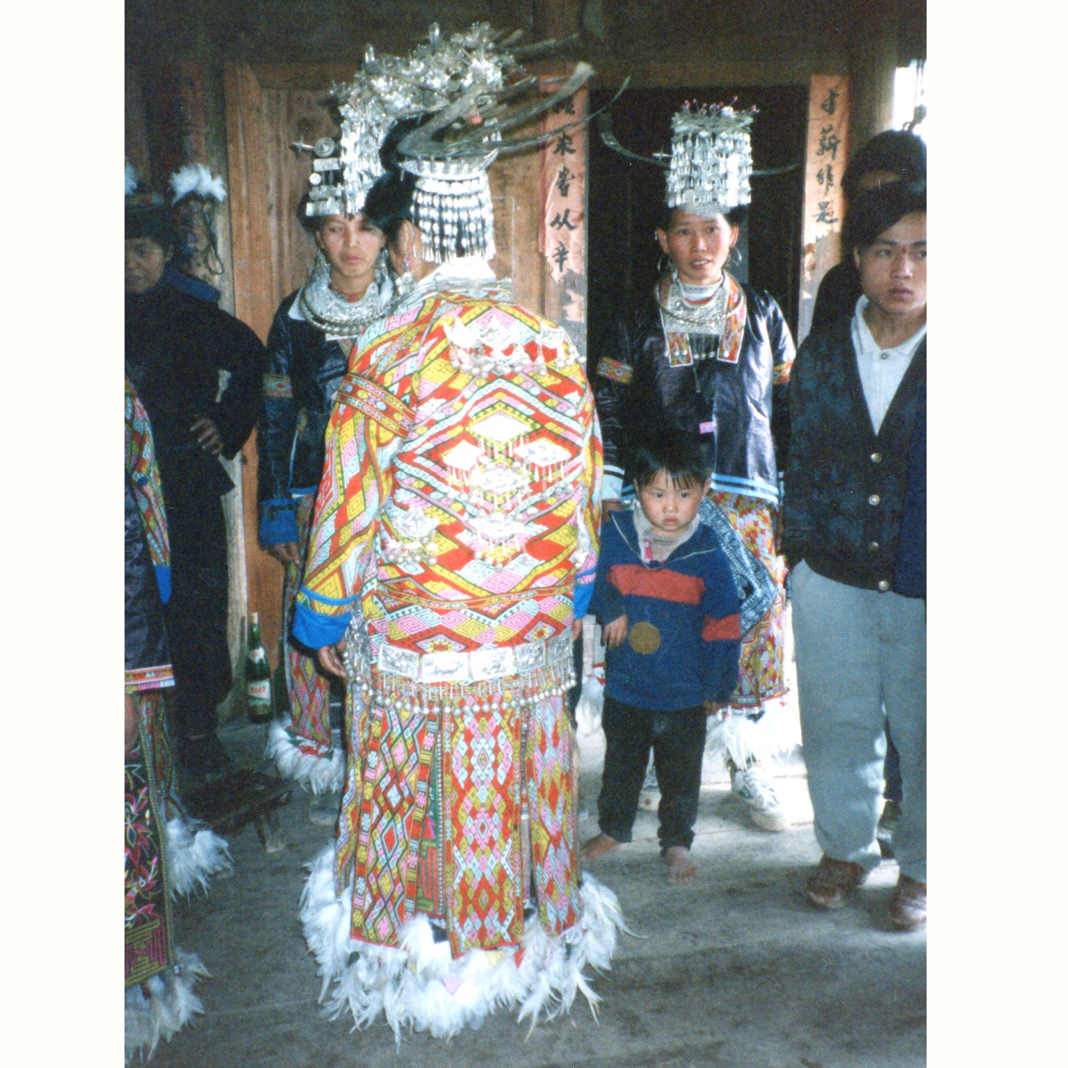
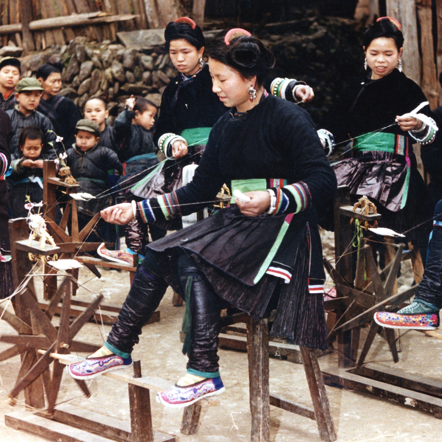
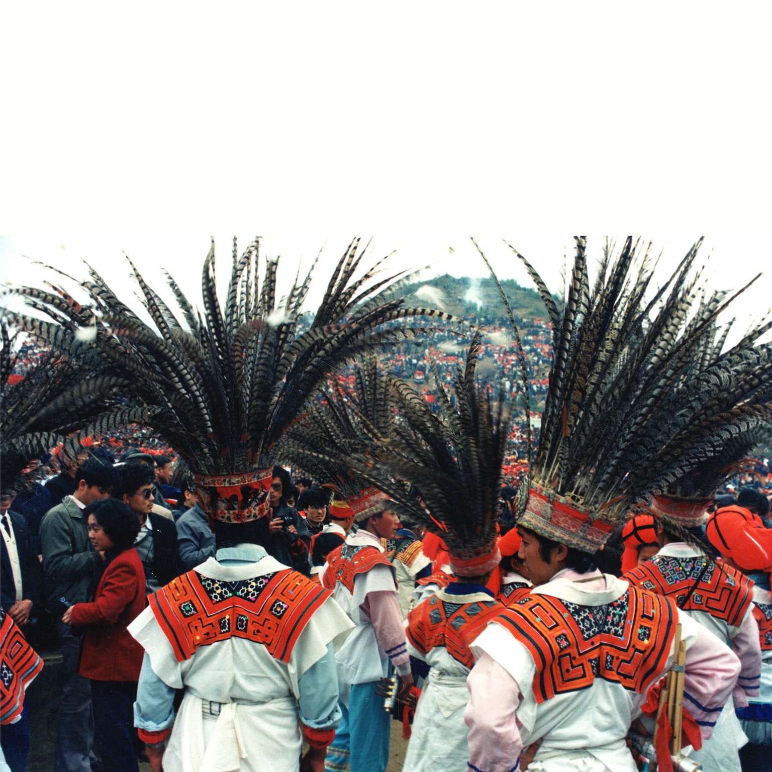
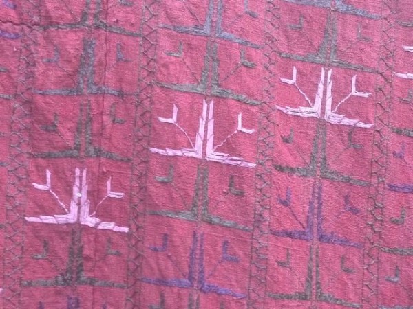
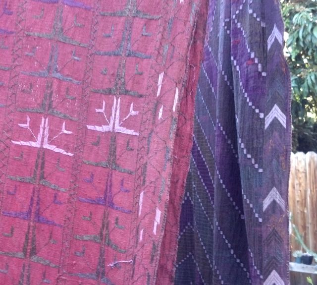
These images are from a group of photos found with a group of recently purchased textiles.
The textiles are from the collection of Sue Goldberg of San Diego. (I also have a couple of her magazines). I was told that she used to go to China every summer to visit the Miao and to learn how to weave and embroider. Some of her textiles along with her loom went to the Mingei Museum. Got to the Mingei in July and there is a great exhibit on American Carved and Whittled Walking Canes.

Besides the nobel art of getting things done, there is the nobel art of leaving things undone. The wisdom of life consists in the elimination of the non essentials. –Lin Yutang
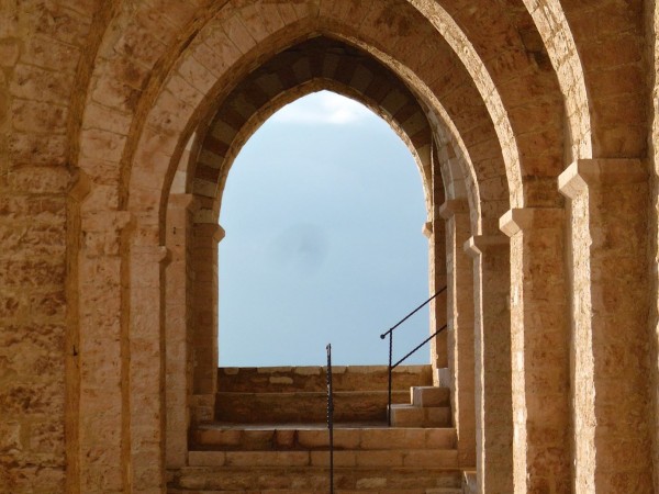
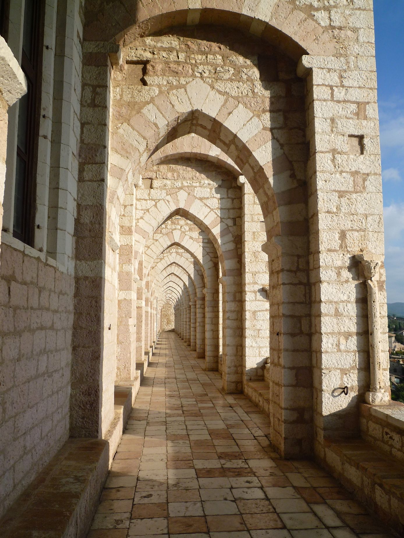
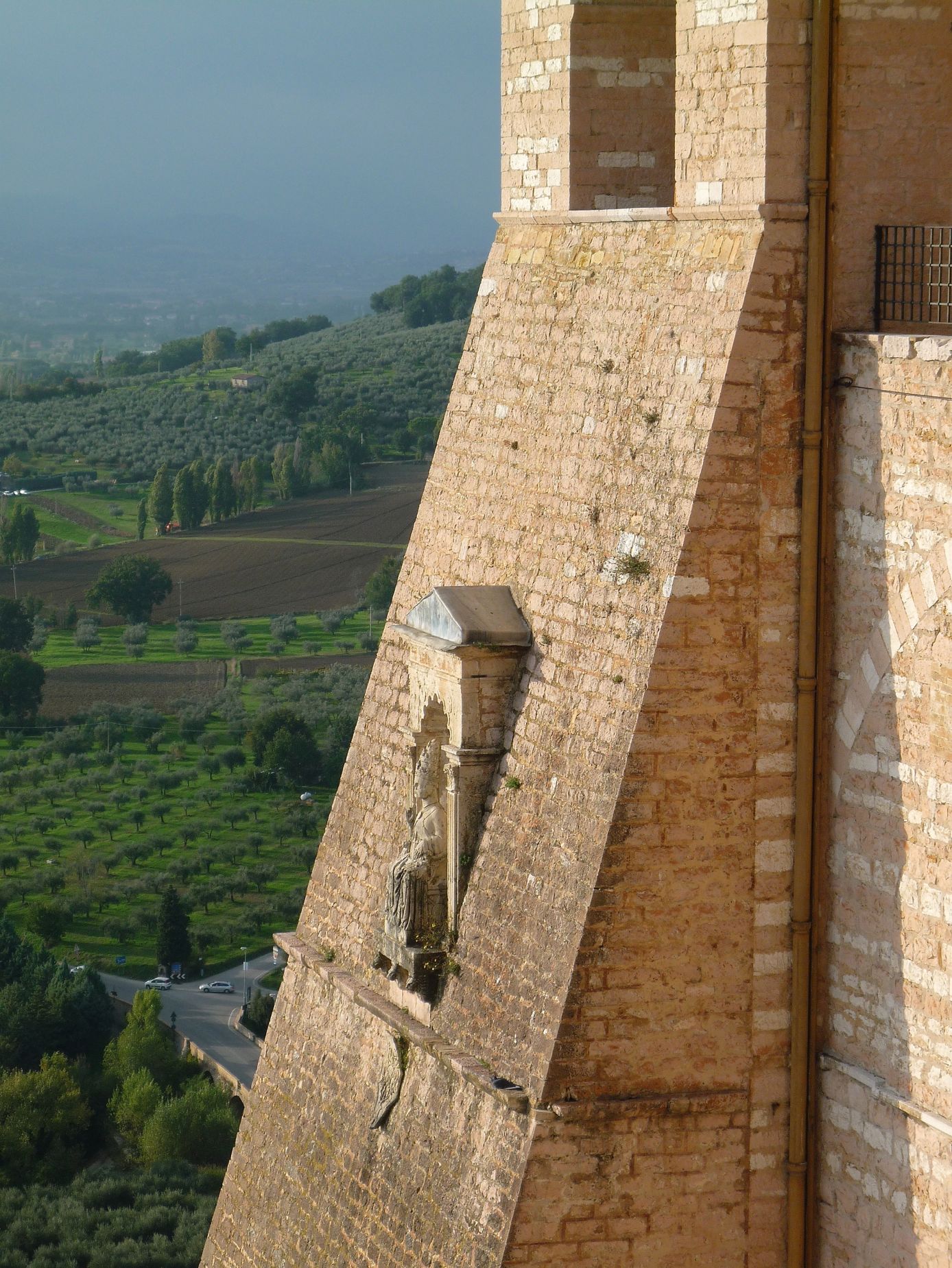
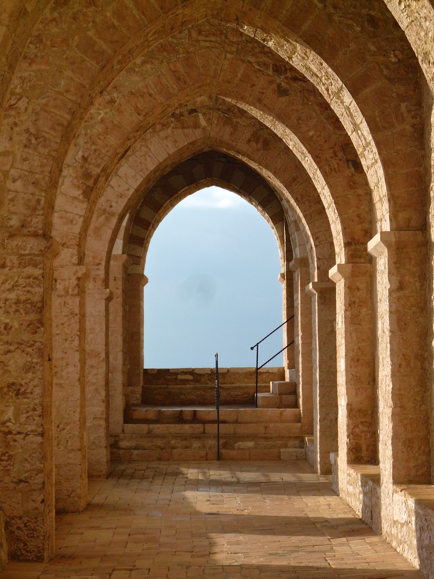
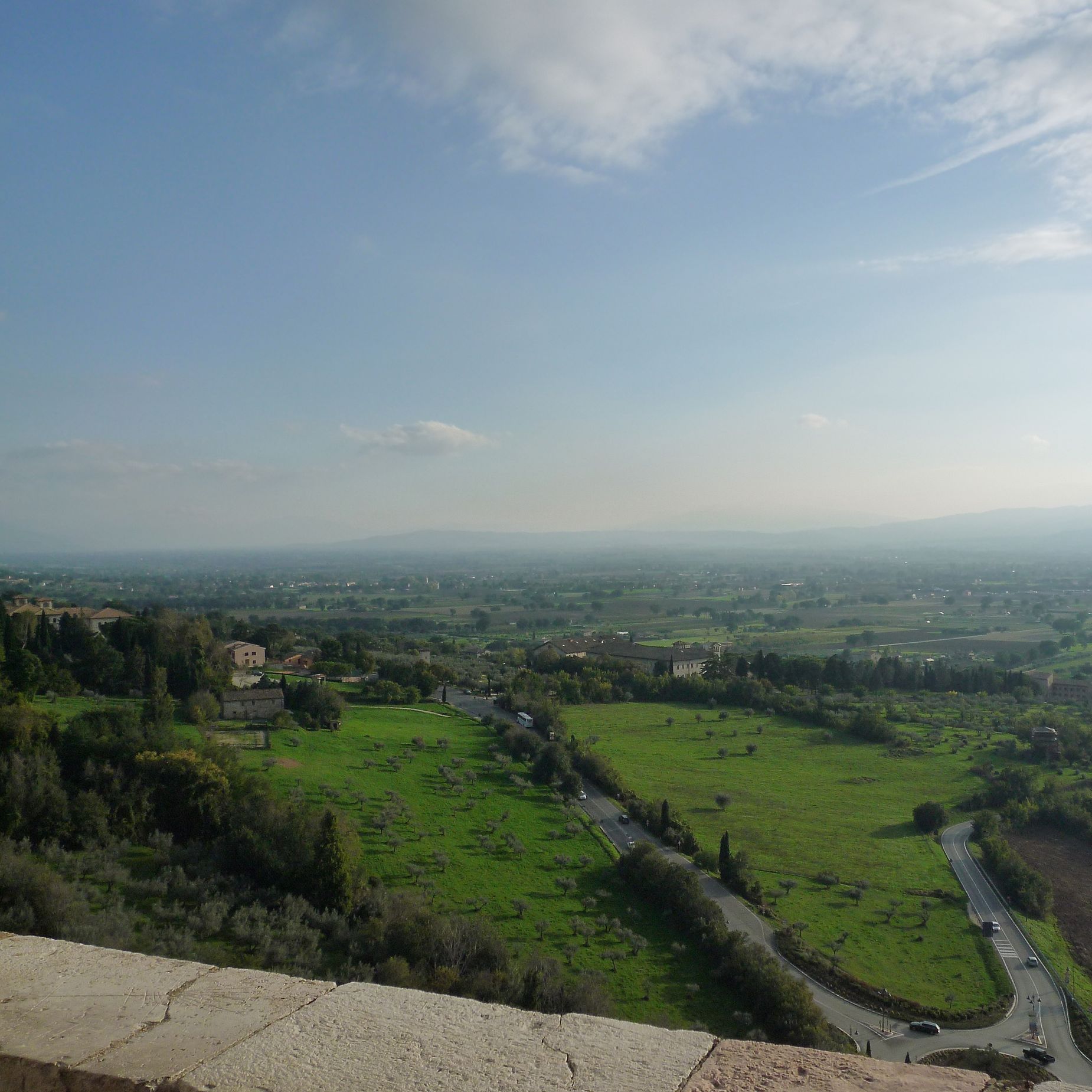
There is something about this quote of Lin Yutang’s our images of the convent of the Basilica of St Francis that work together. Assisi left a wonderful reassurance in the goodness of life even with all of it’s extremes.
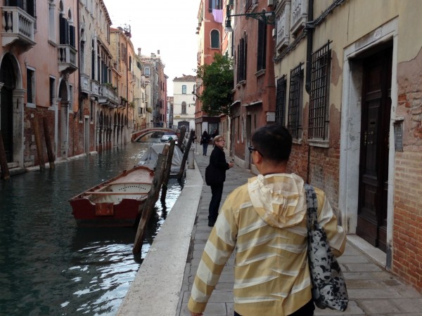
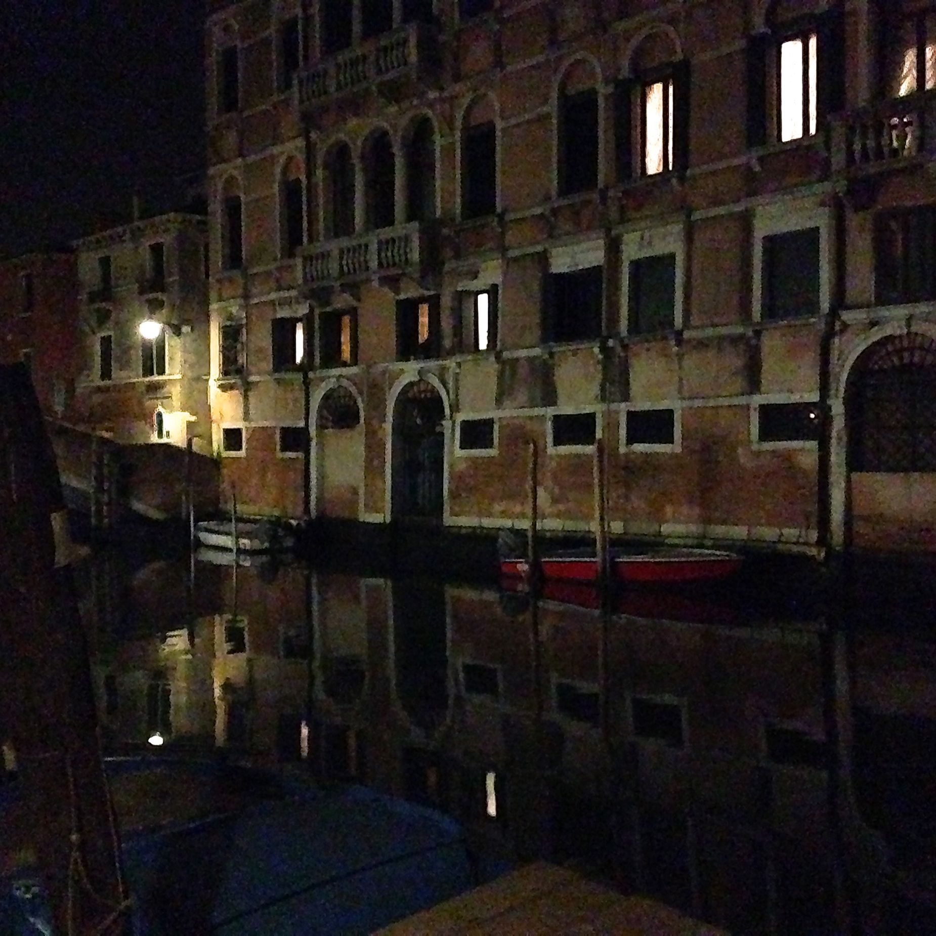
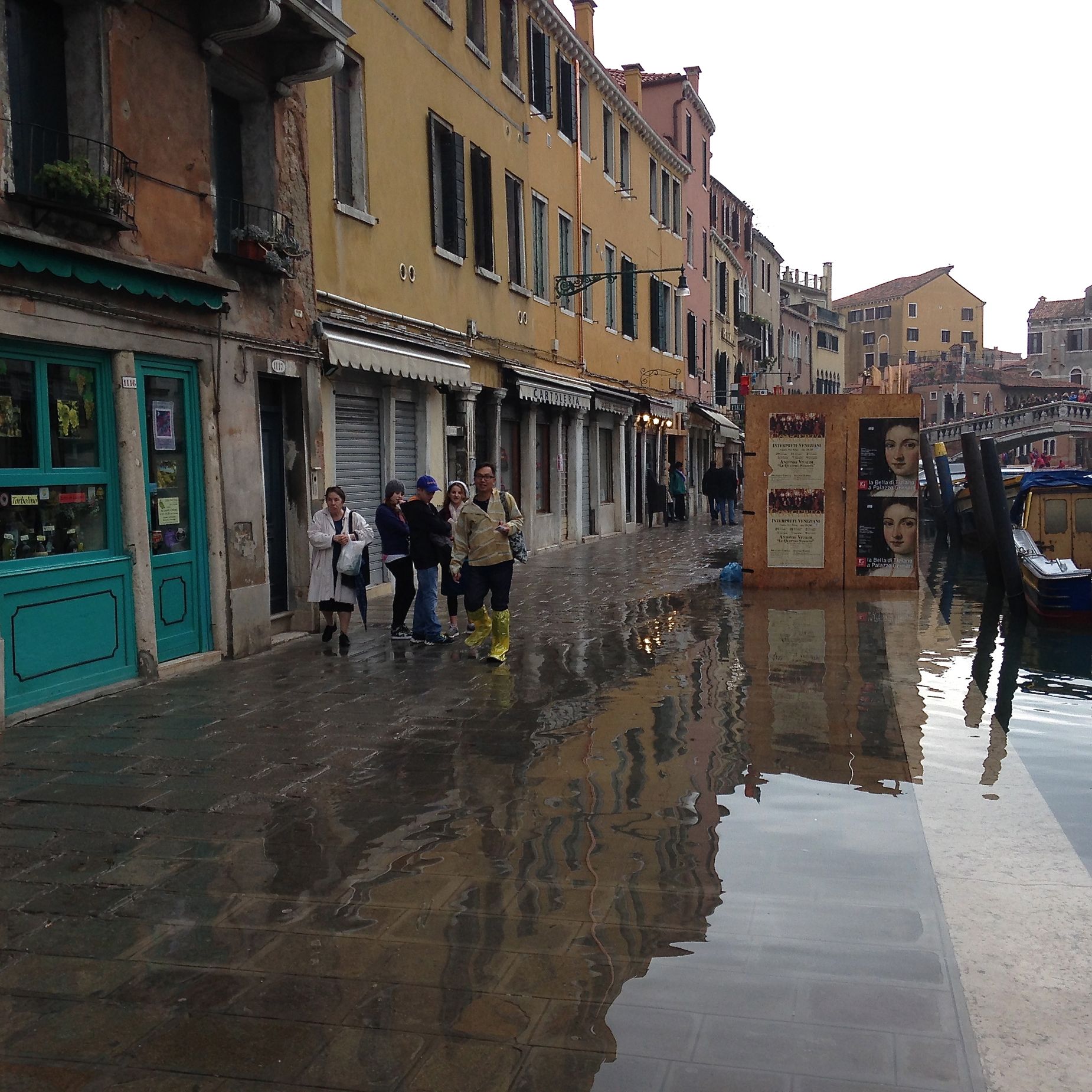
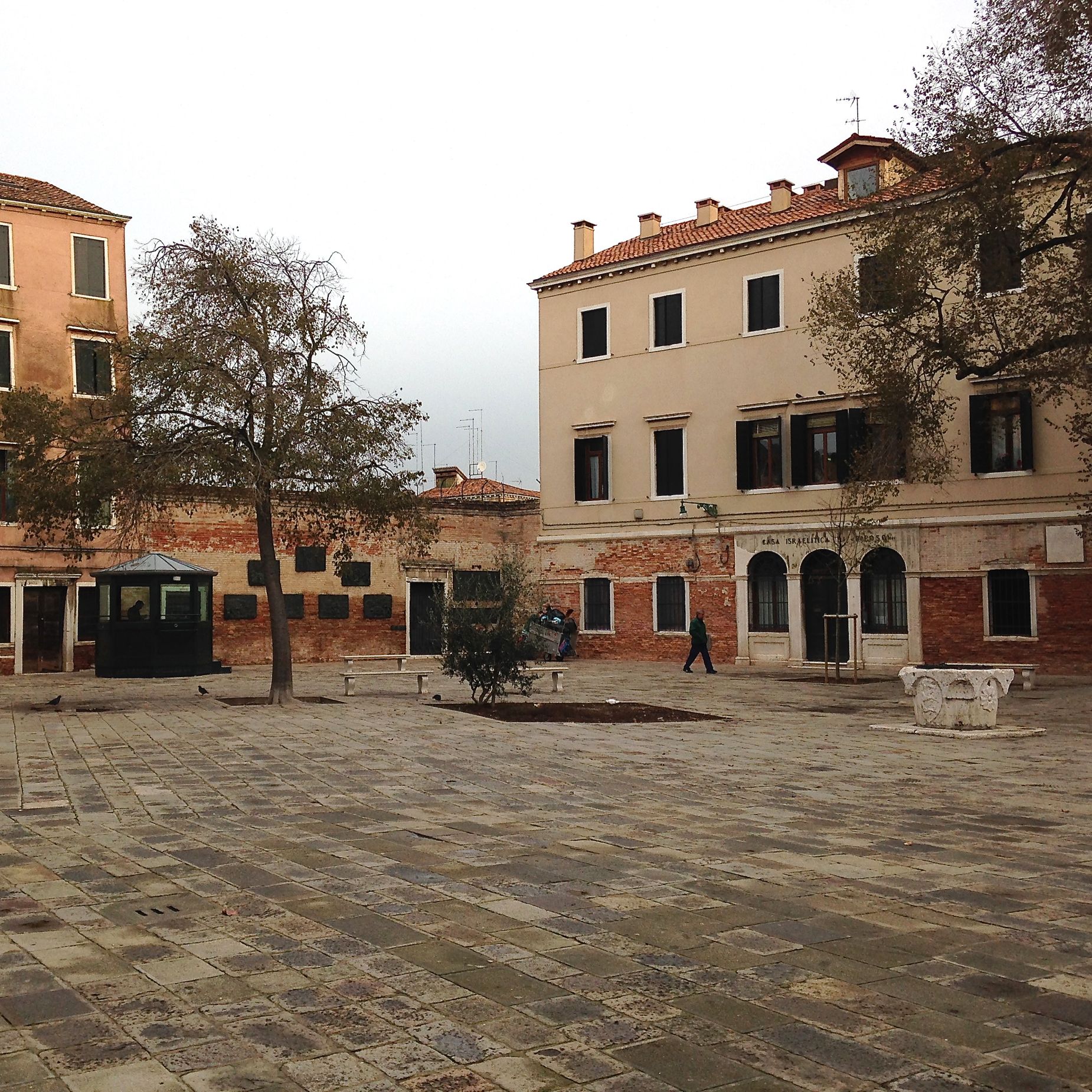
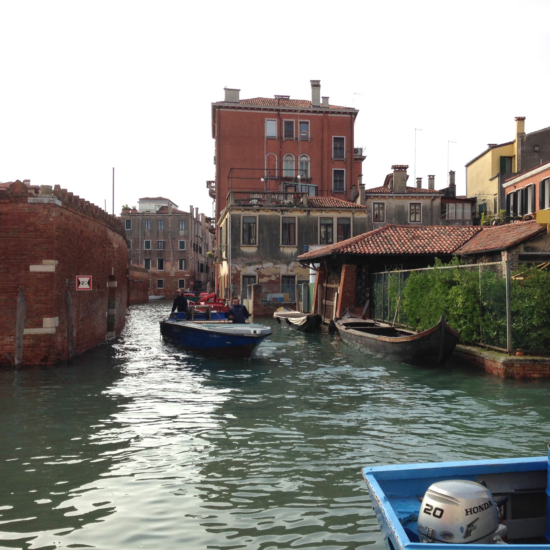
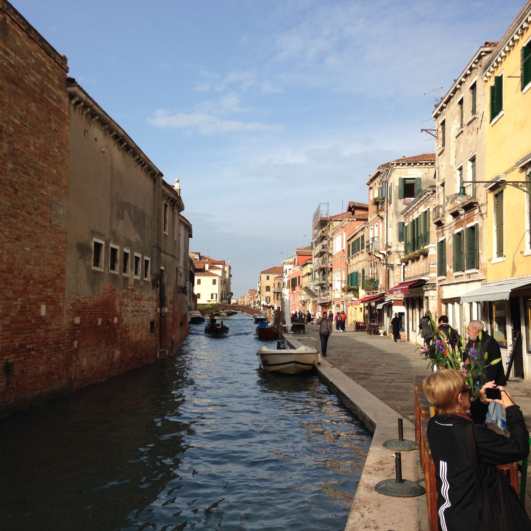
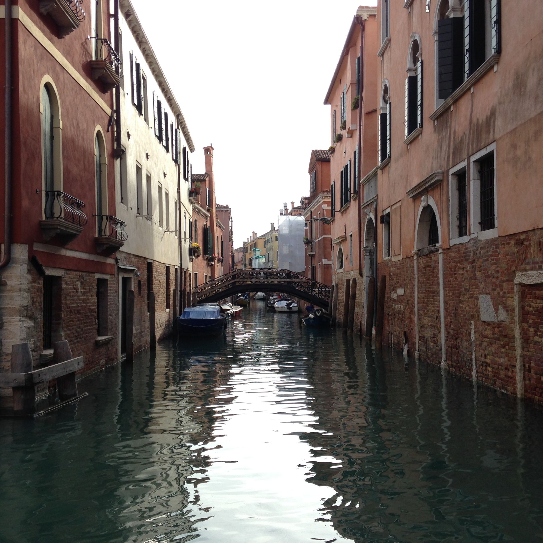
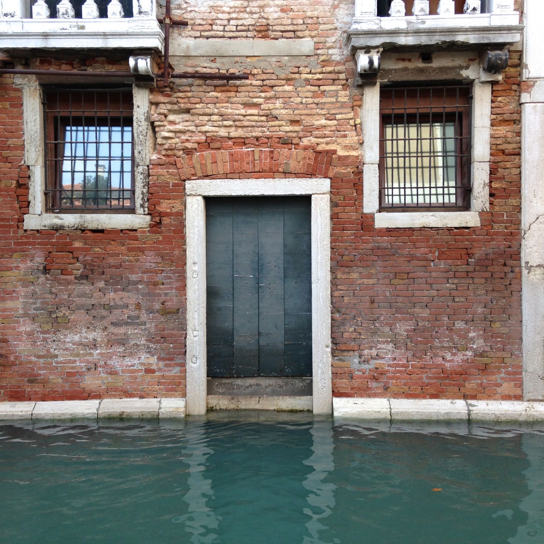
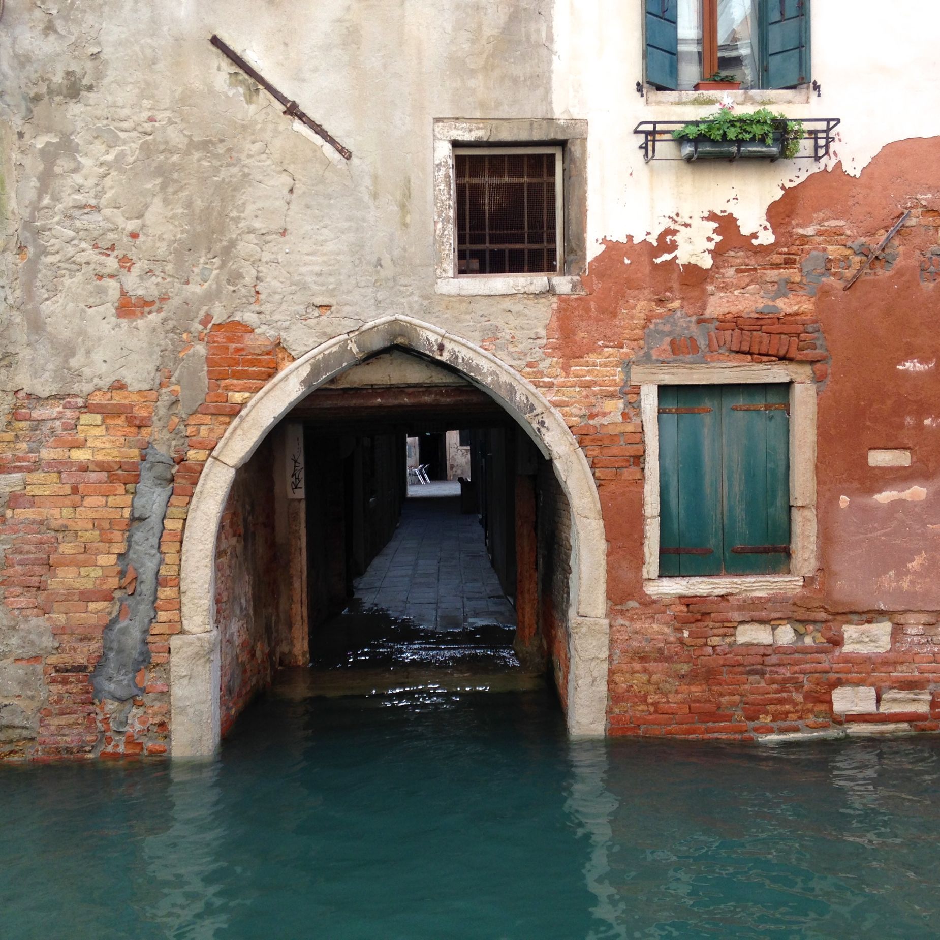
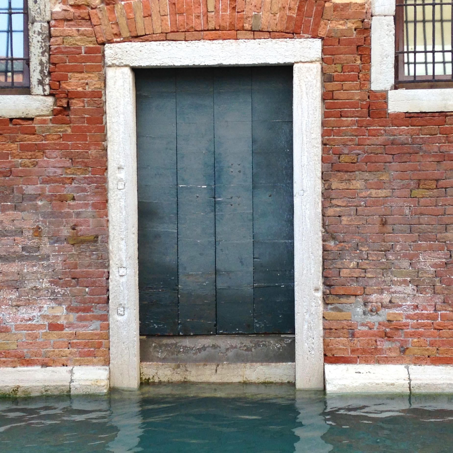
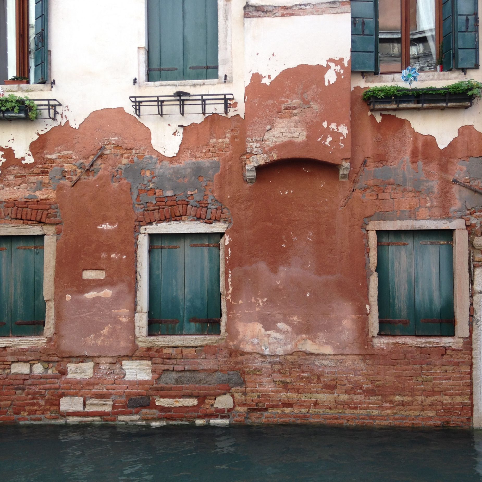
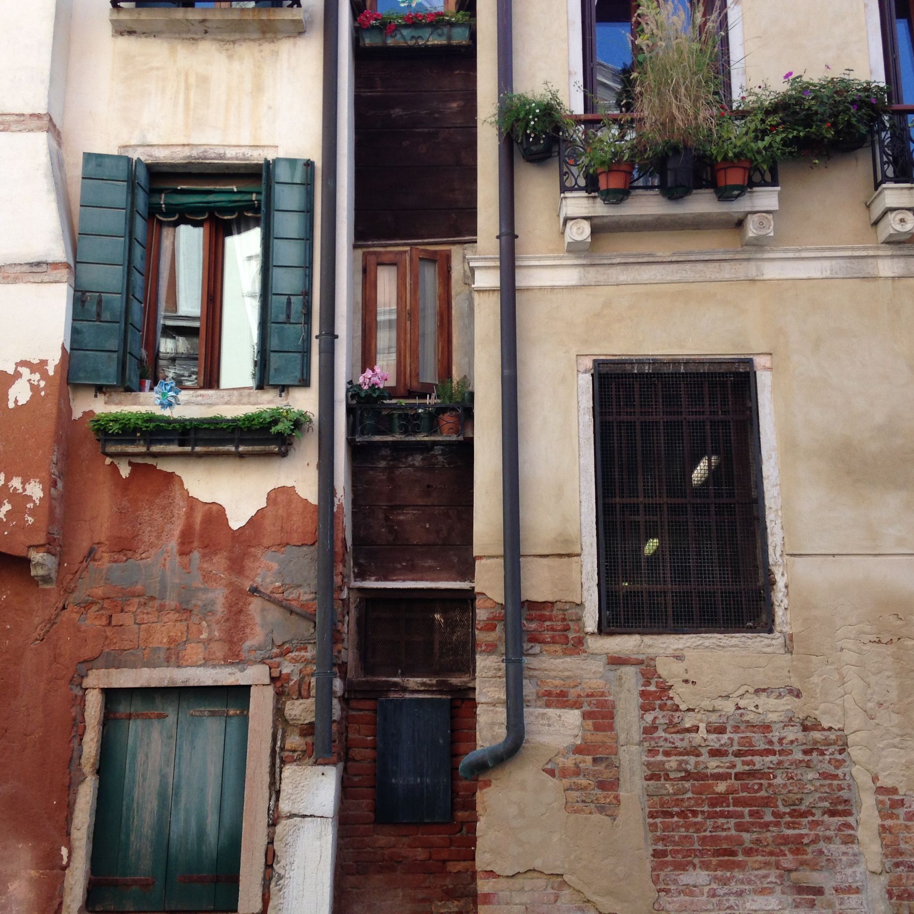
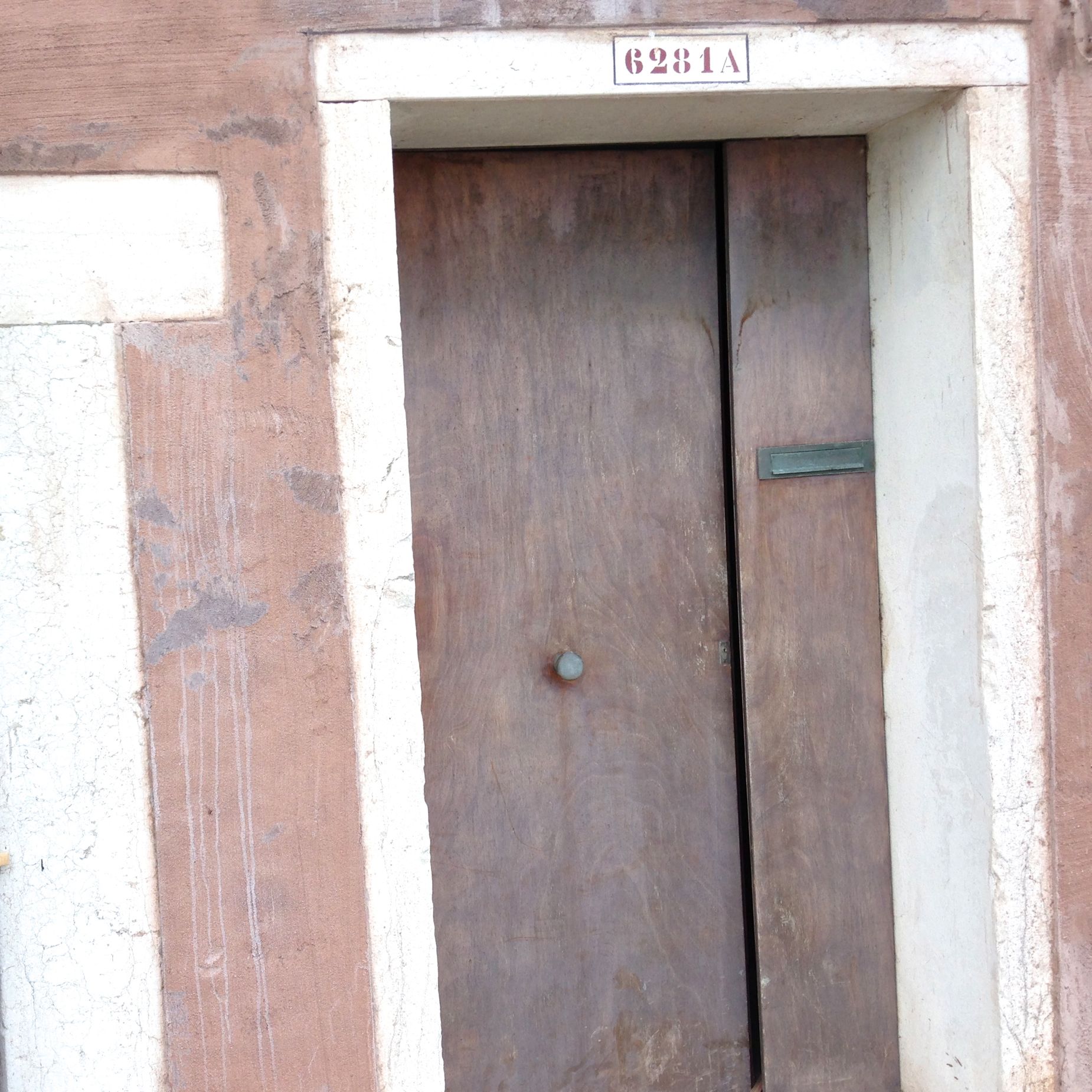
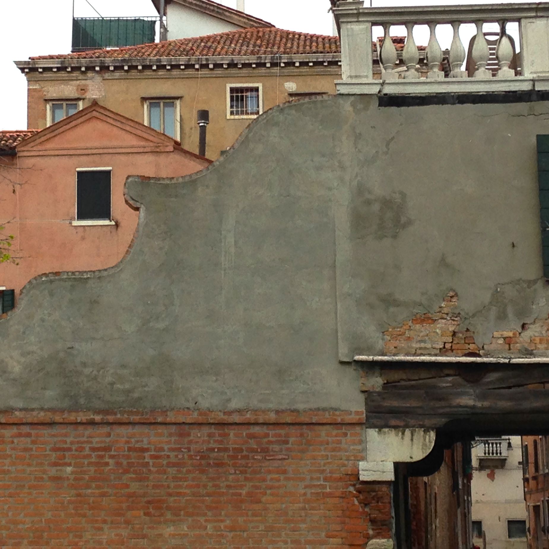
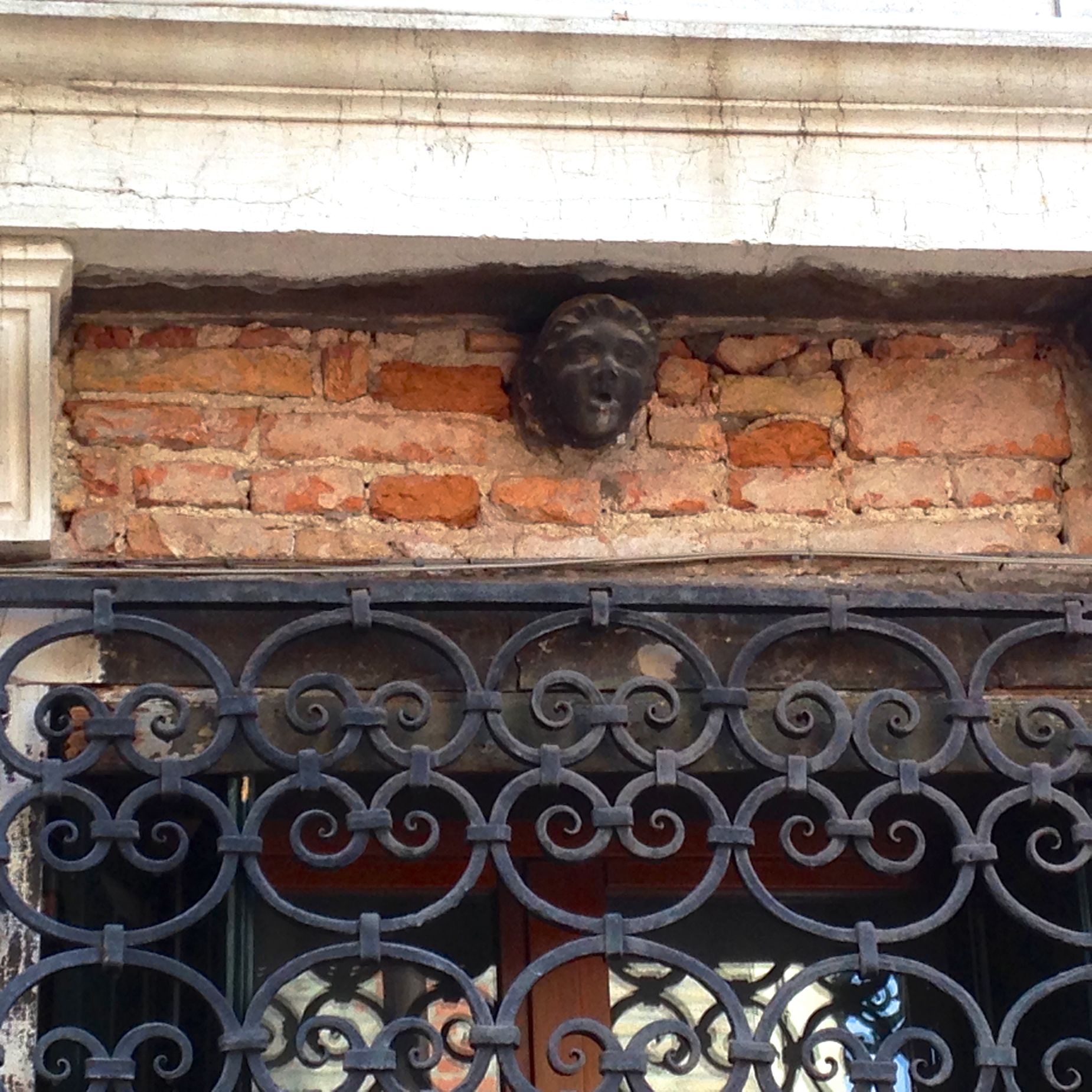
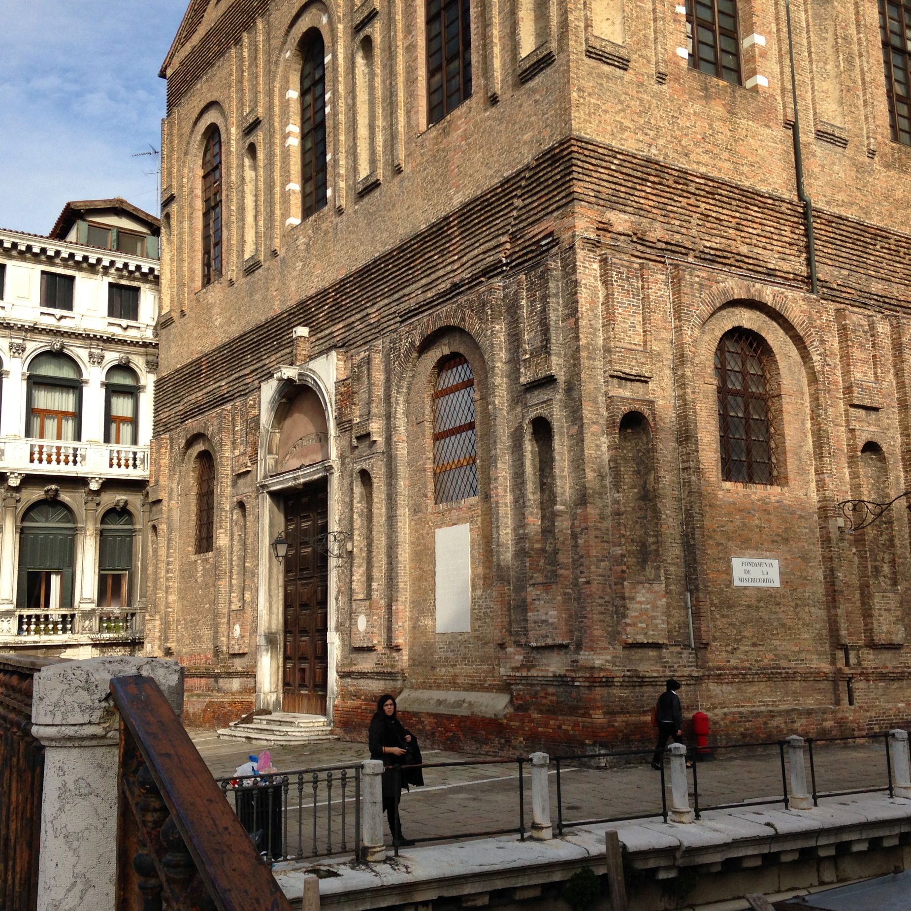
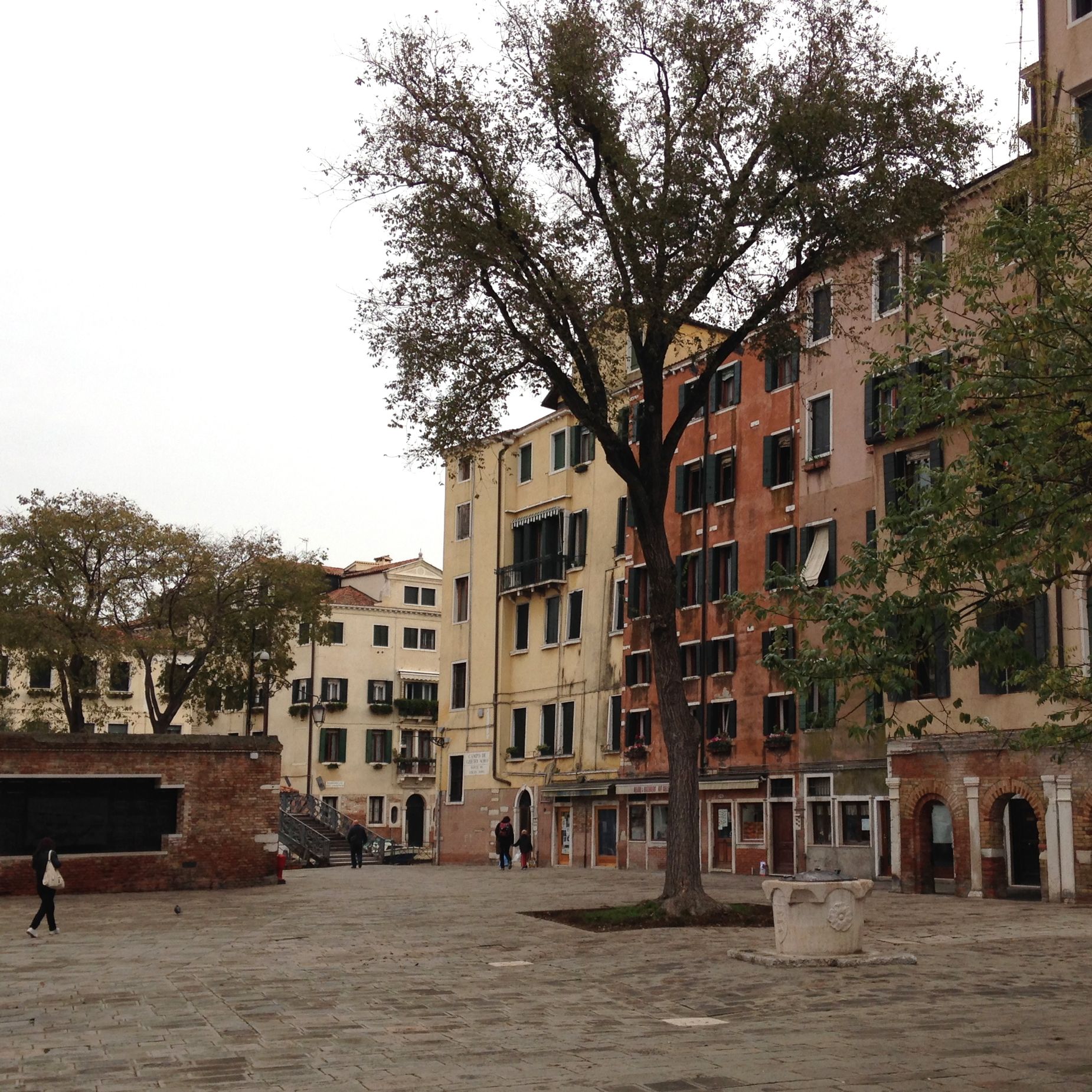
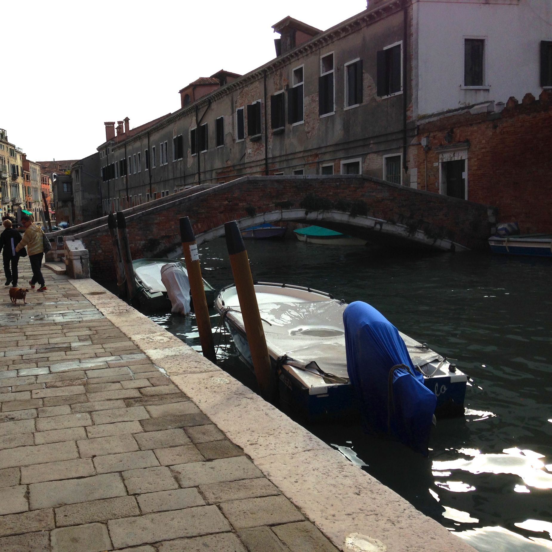
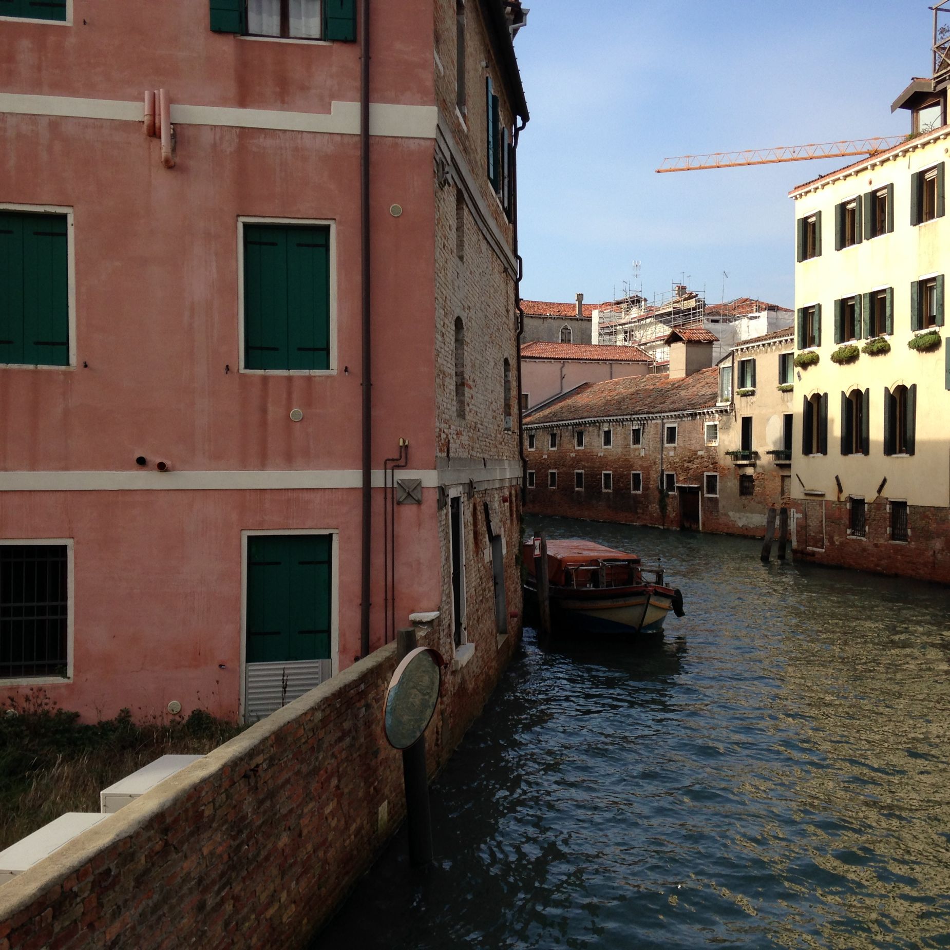
So we just got back from Italy on Tuesday. These are some pictures of Cannaregio– the neighborhood we stayed in Venice–shots of vistas and treatments that you just want to keep staring at so you take a picture and move on. It’s beautiful in it’s rhythm and order; and I would describe it as surreal, but I’m not entirely sure what I mean by that. It is floating and melting and then flooded with colors and details that I thought if I were a decorative painter I would die to get right.

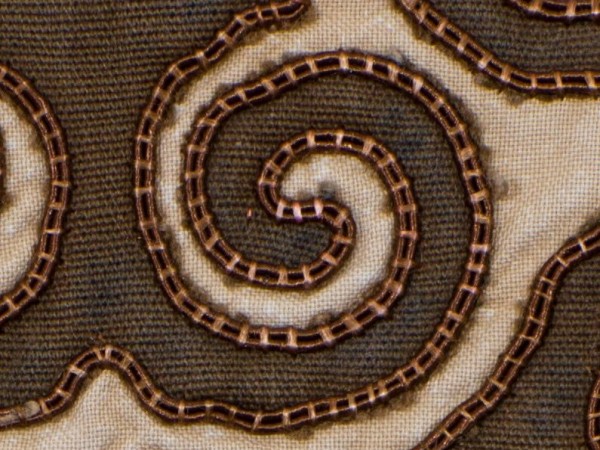
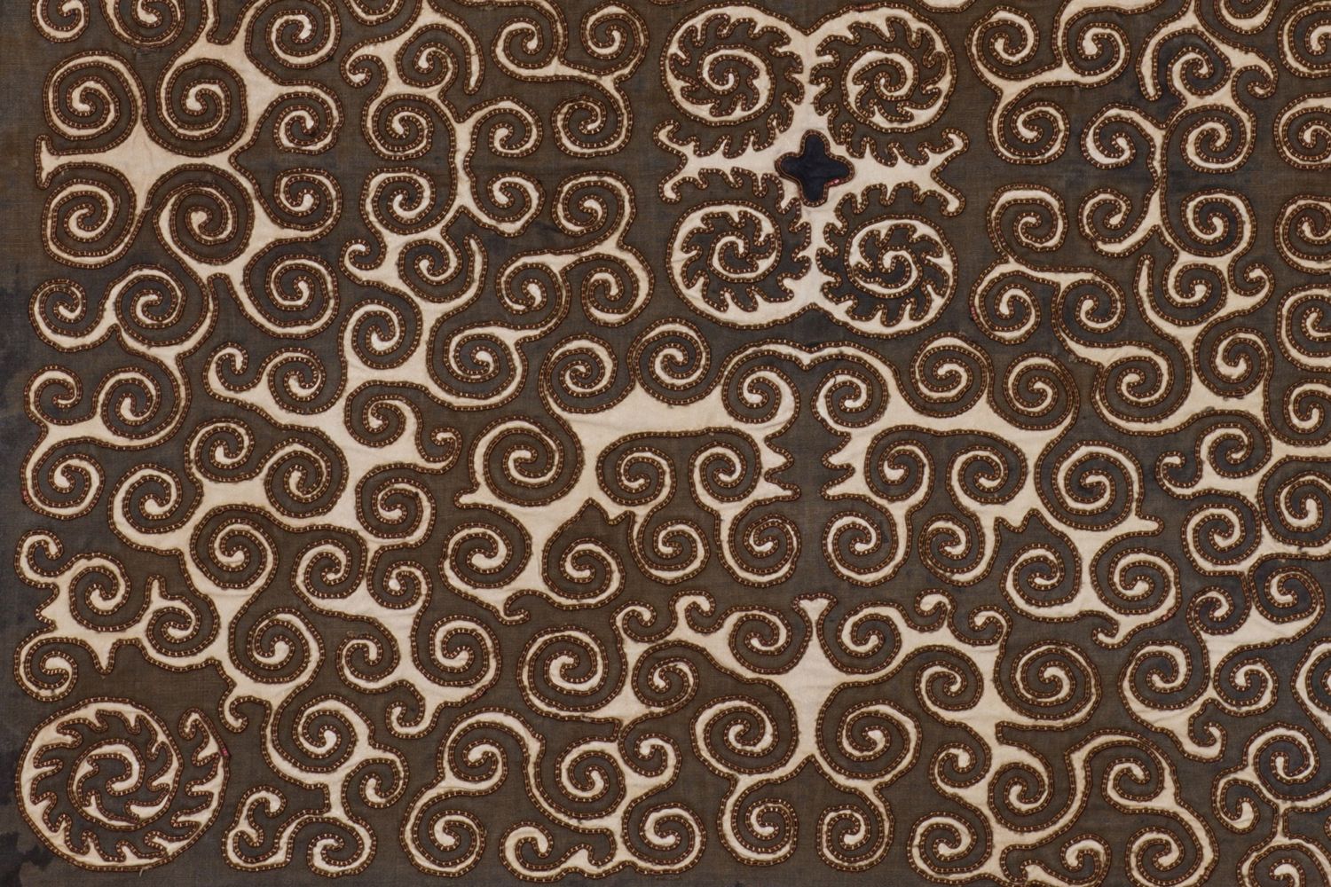
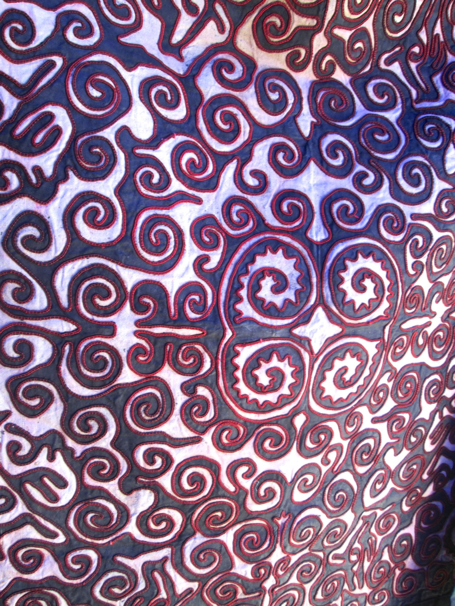
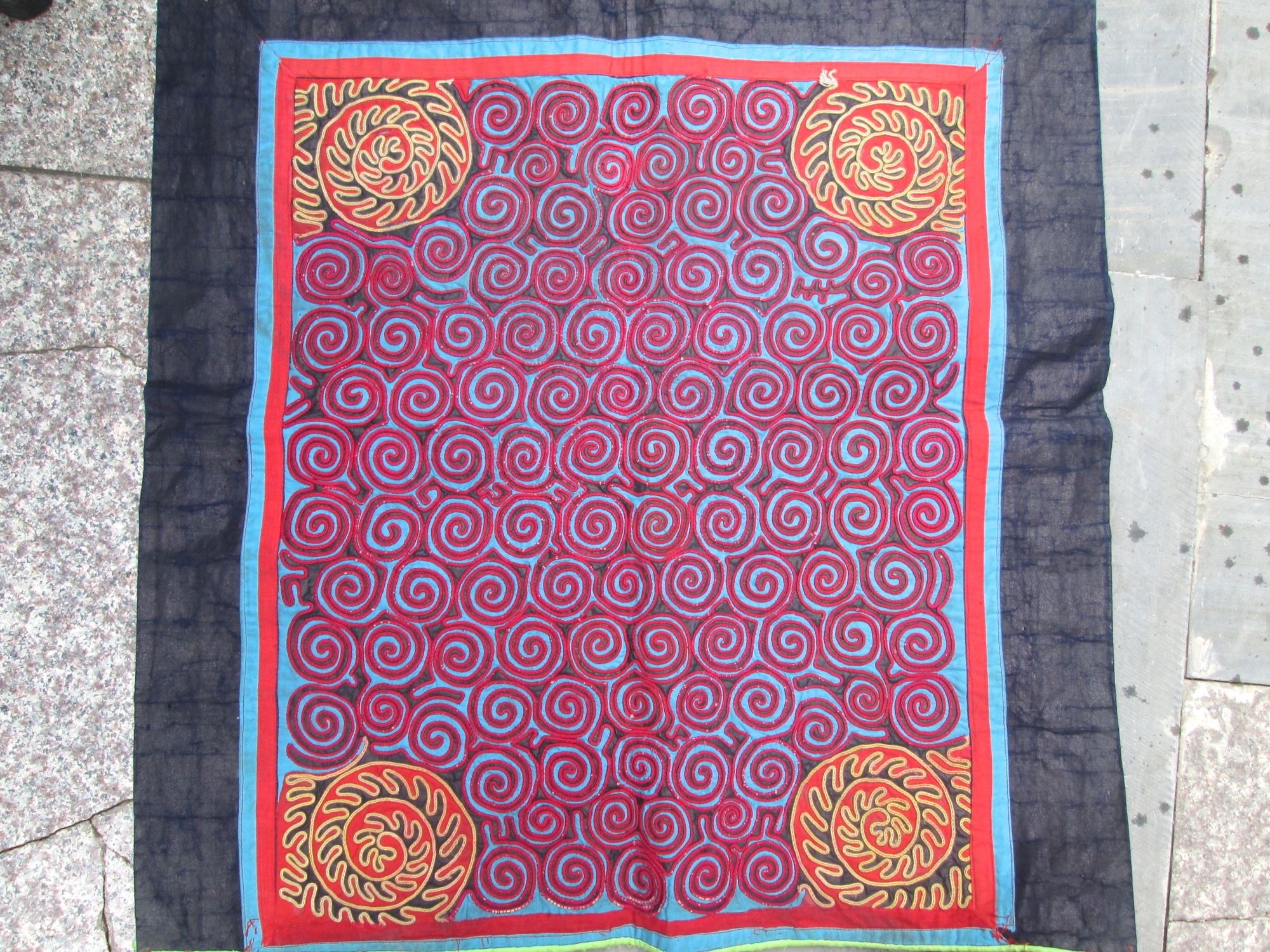
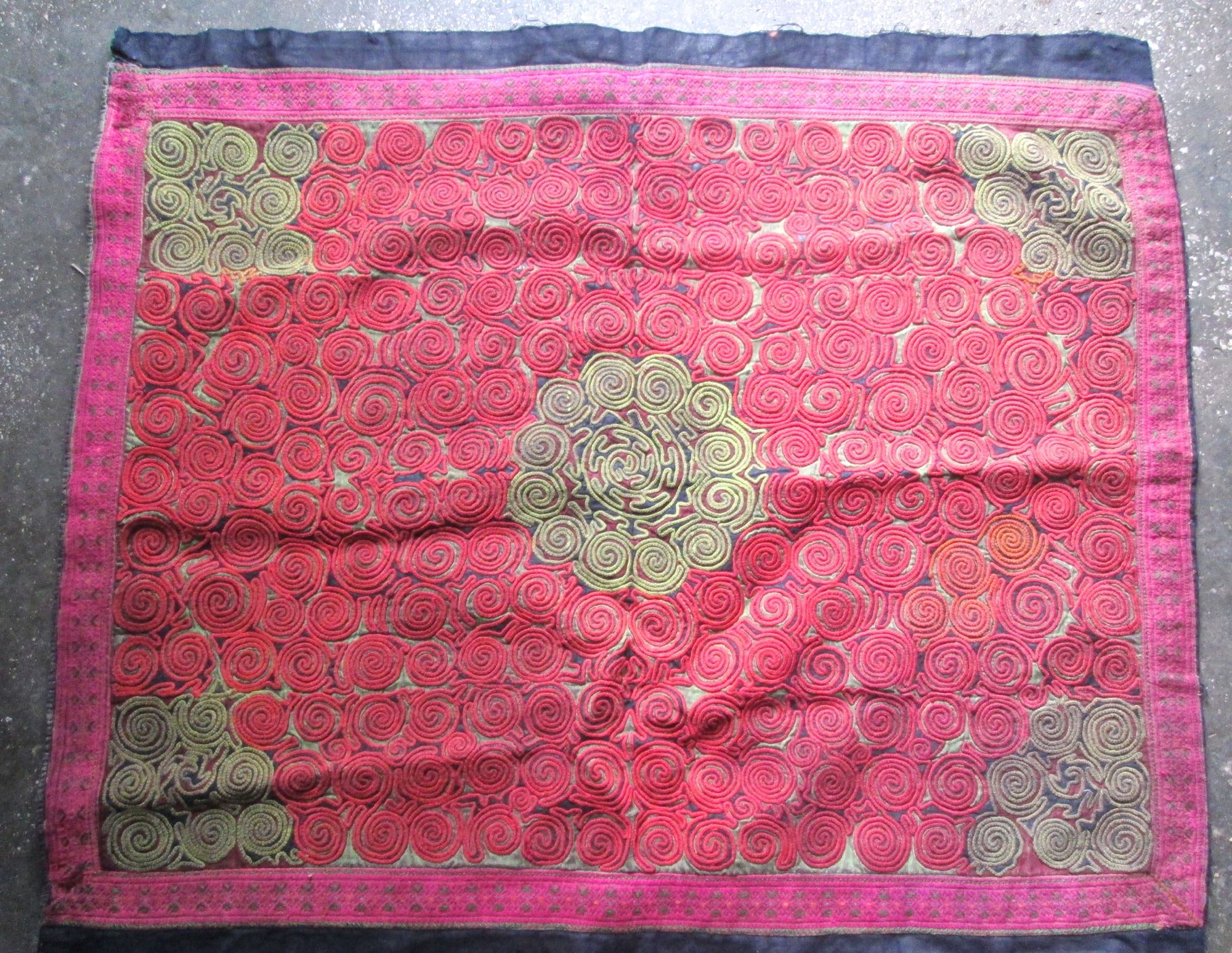
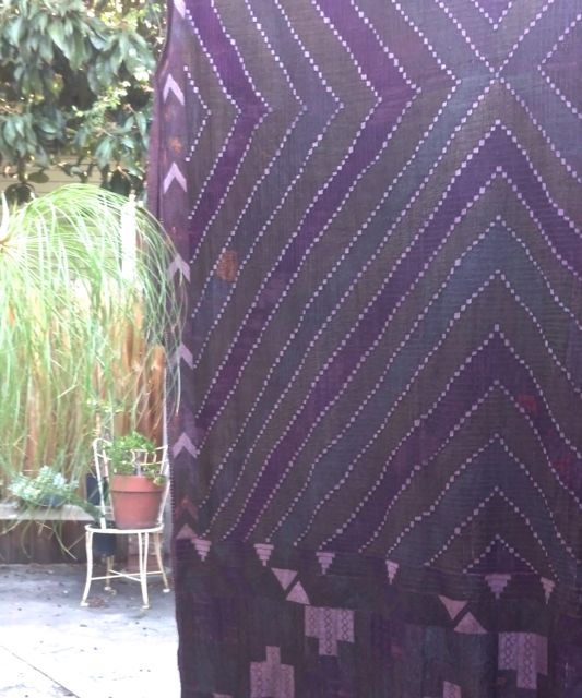
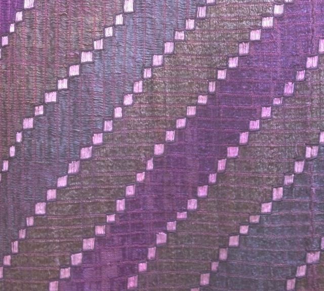
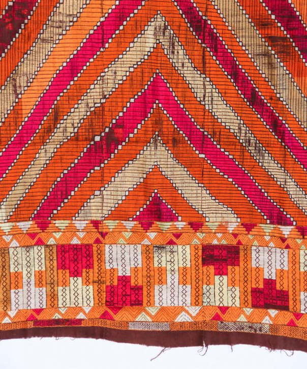
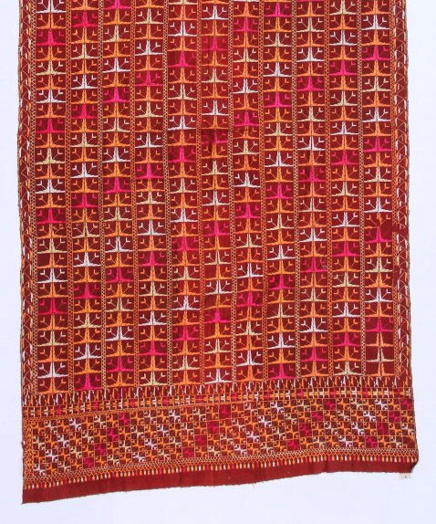
I posted earlier that I’ve been researching the narrative of this textile. I wrote my dealer friend Zhang and he told me that they are butterflies–made by in Guizhou by the Jin He Miao. They live in a village about 5 hours from Kaili City.
It’s really the butterfly antenna, I would add that the movement of the design represents the the flying butterfly. For the Miao the butterfly is a main motif of their embroidery. Since they do not have a written language, their narratives exist in their embroidery. The butterfly connotes Butterfly Mother, who created the world and created the Miao. I’ve included a couple more pictures of some of the same motif that Zhang sent me.
These are still drying in the back yard–phulkaris that I have dyed to more muted colors. The befores are at the bottom of the post.


It’s August. I am visiting posts started in July.
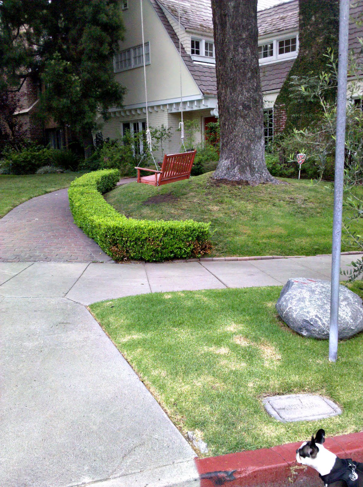
Everyone seems to love a dog, I have been finding this out as I am dog sitting this week. Here is Stanley peaking out of the red zone.
I like red. It used to be one of my three laundry loads: blacks, whites and reds. I’ve started wearing red shorts and trousers but red doors make me jittery in the early morning. “Look at me! Look at me!”
I like to think of red as a directional way-finder. In my search I was led me to a blog called, Deep in the Heart of Happy which tells that the associations of red doors perhaps related to money, hospitality, Christianity and feng shui.
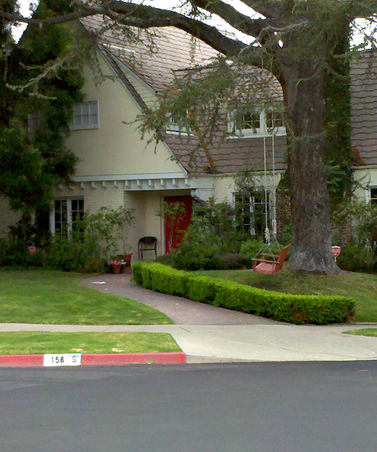
But now that I’m back from my walk and typing in my Hancock park adjacent apartment aka Koreatown my floor has been thundering boom all morning with a neighbors vague electronic bass. I have been fascinated by Lynn Yaeger’s archives in the Village Voice instead of making pillows and wishing that I had planted some Swiss chard in one of my pots instead of more succulents. After studying the pictures further. I think I like the red door. It’s soothing with the yellow paint. I might however want to go and paint out the red zone on the curb.

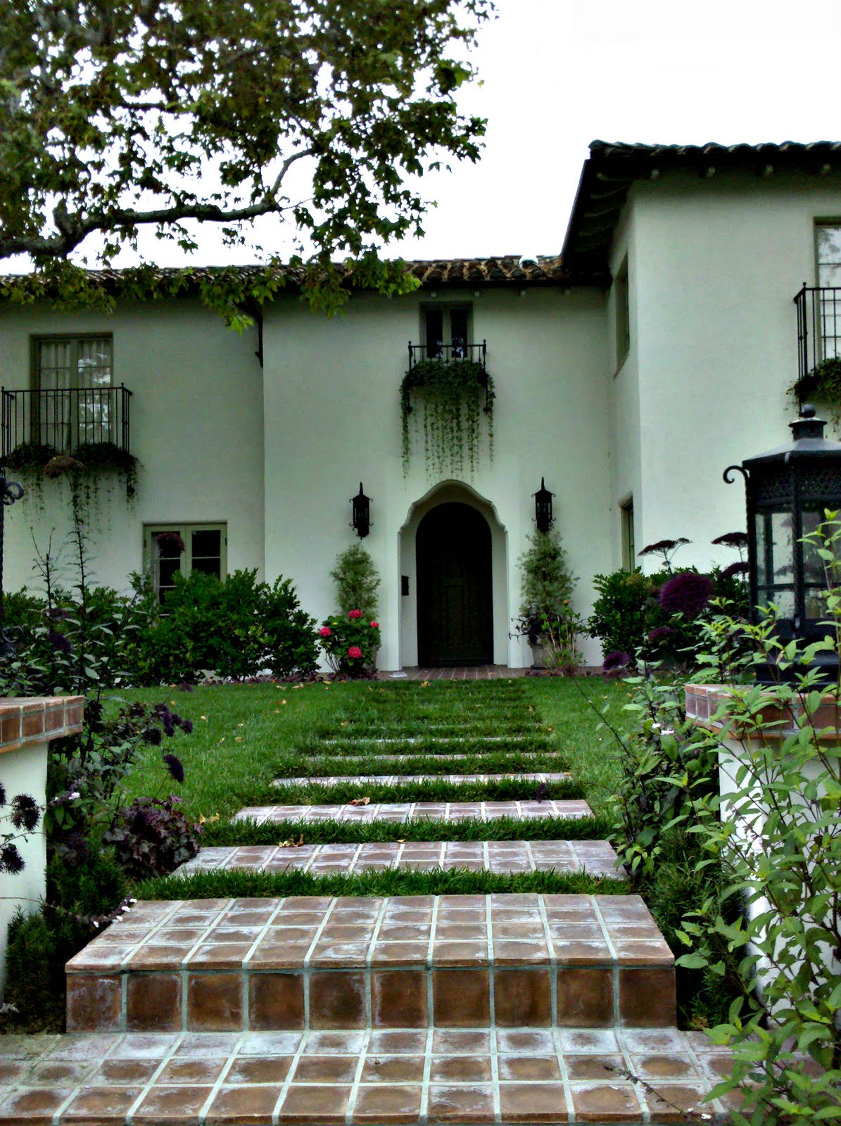
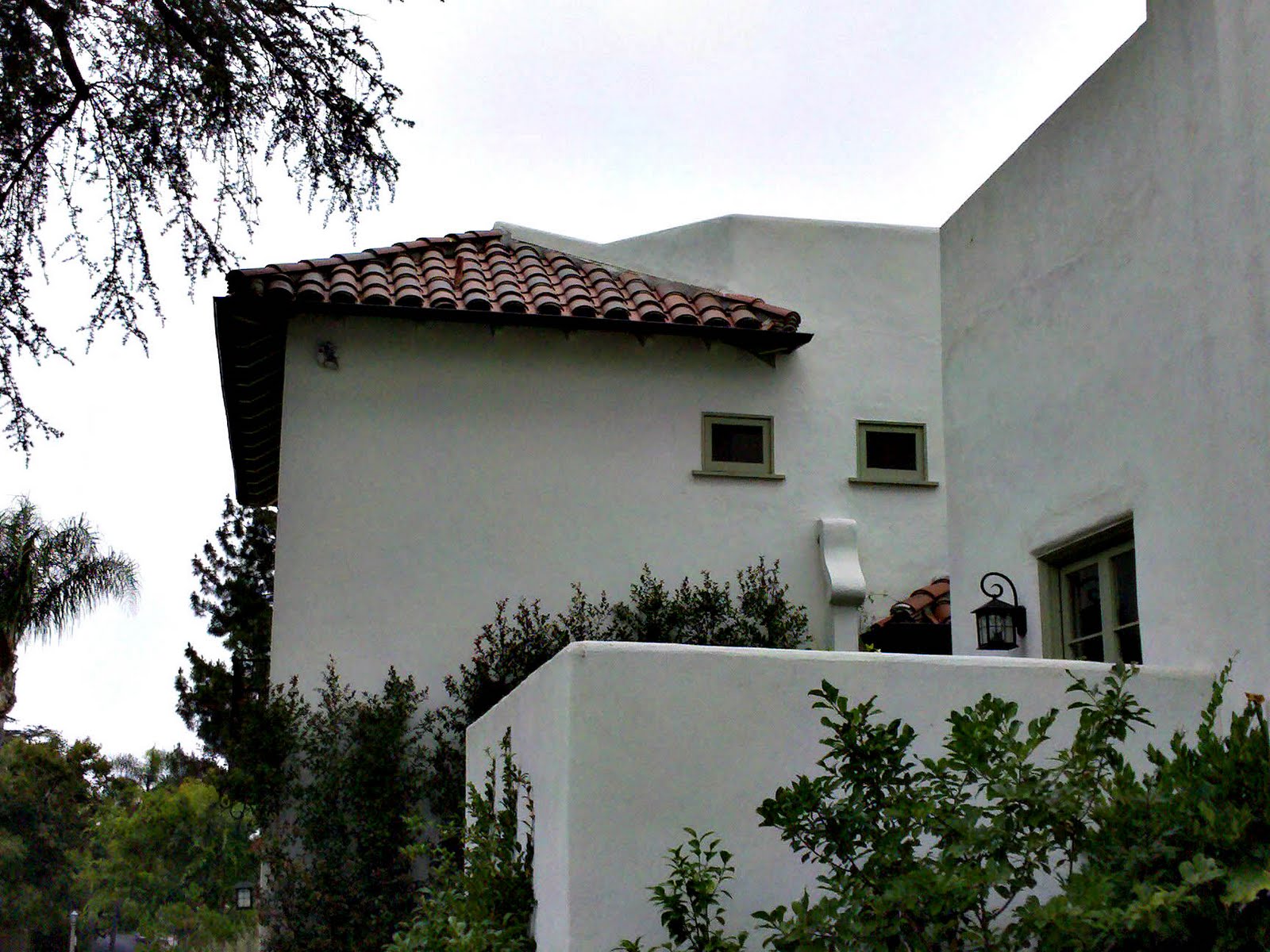
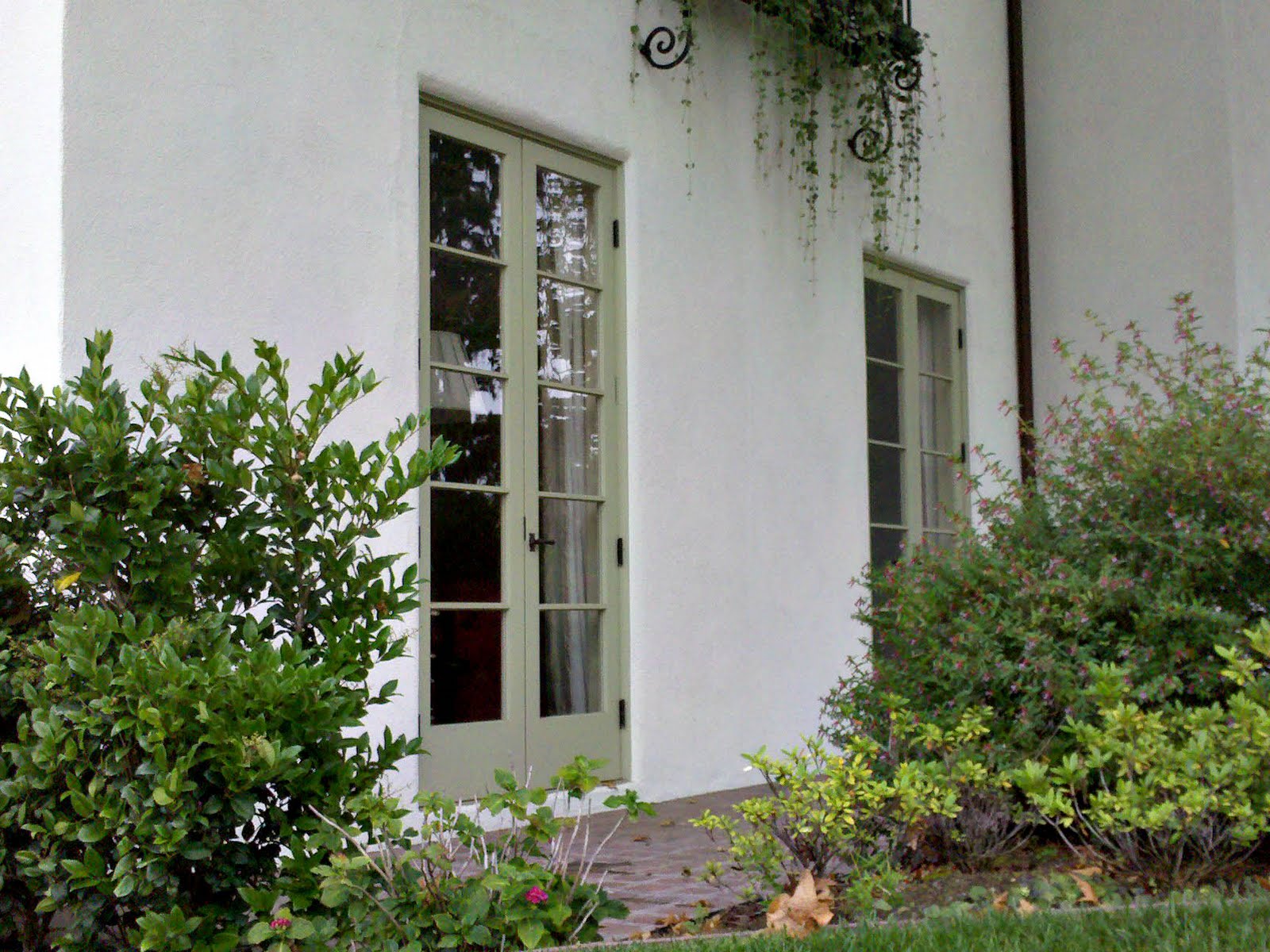
In this second house, I find the composition and color scheme particularly charming. It’s sophisticated. The rather uninteresting windows and doors are tagged out in a color that simplifies. Skims them out to recede to the background instead of what is typically done which is to highlight and pull things to the foreground. For weeks I have been walking by this home and hadn’t noticed the green colored trim which is why it works. It pulls the landscape up and what you do notice are vines dripping from their boxes from above.
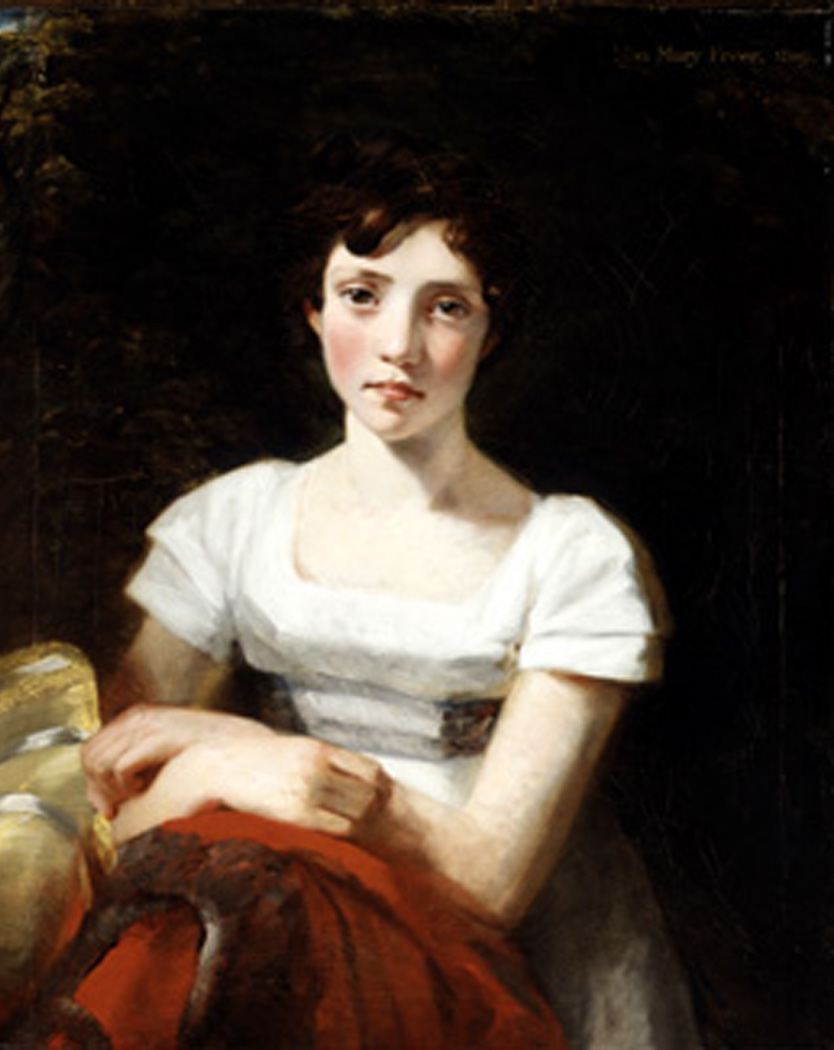 Mary Freer by John Constable, 1809
 Pontius Colors
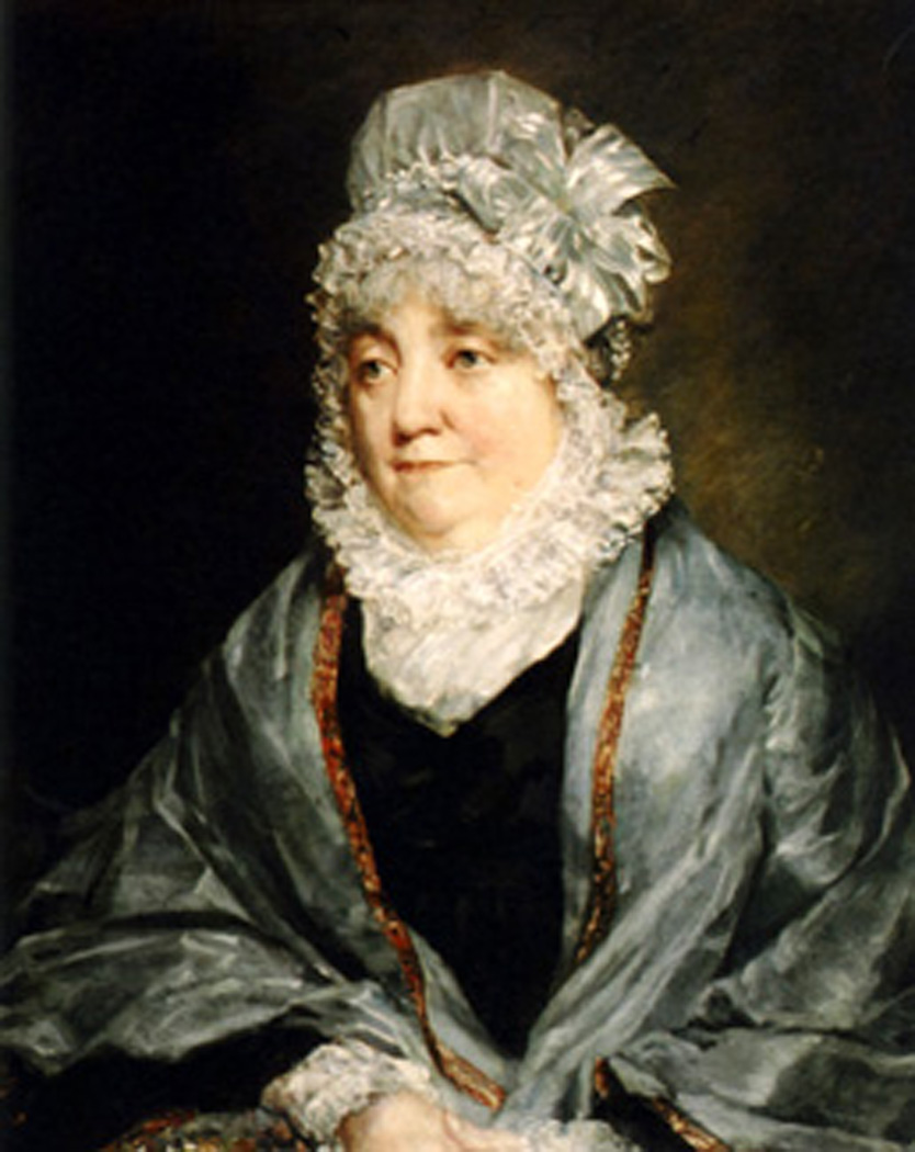 Mrs. Tuder by John Constable, c.1818
 Pontius Colors
It has been so long since I have seen the lovely Isabella LaFitte that I can’t remember if she looks more like Mary Freer or Mrs. Tuder. Certainly still like Mary, as it really can’t have been that long. “Where has she gone off to?” I wonder early in the morning while drinking my coffee. “Off with a portrait painter; a sojourn, waiting for beauty to return to art.” I answer to myself.
But what has happened to the portrait painter? What has happened to Allegory with a capital ‘A’ ‘? Suppose for a second, what would you consider the modern equivalent of Napoleon’s bee, Charlemagne being it’s precedent?
I wonder, (speaking generally here, not of Isabella’s) is the portrait painter obsolete with a click of a camera an aptly edited in Photoshop? Is that it, be gone? I must say that there is a specific talent in photography, in the capturing of that there there. And, was very impressed when my photographer friend Roger took my photos and got something by far more me than my own out stretched arm aiming back at myself.
So back to portrait painters… Lucien Freud is all I can think of, and then there were a couple of those Bloomsbury painters but can we call any of them proper portrait painters or should we say painters of portraits?
Here is Constable. Known for his landscapes–portraits quite pleasing– and if you are in London I would see his show at the National Portrait Gallery which runs for several more weeks and let me know what you think.
And please Dearest Anonymous, I love your comments. Who is your favorite portrait painter? You have written so many books, you have composed so many songs, and even painted a few portraits yourself, certainly please–tells us, who is your favorite?
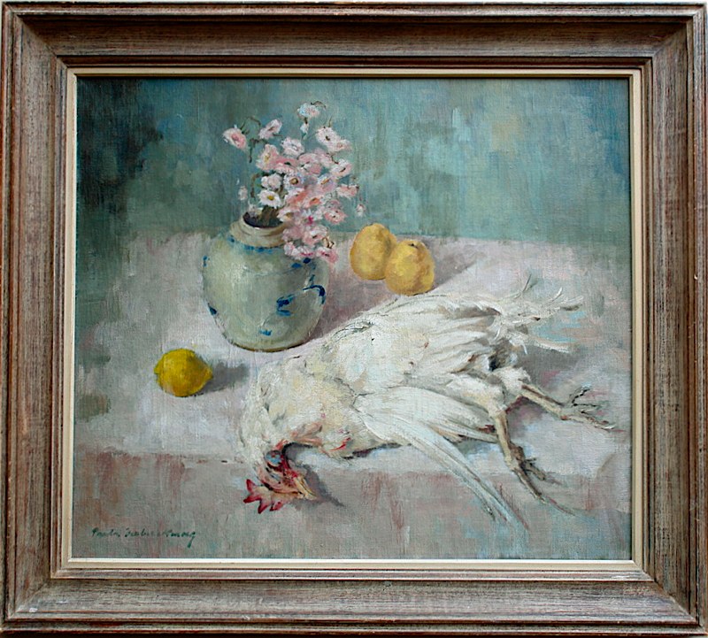
Who wouldn’t want a painting of a dead chicken? I can’t quite remember where I read that what human beings have to resolve for themselves is that to live, something has to die. Being removed from the killing is always easier and cleaner. I recall someone else, (maybe Timothy Leary) said that both cows and cabbage scream–it’s just that cows are louder.
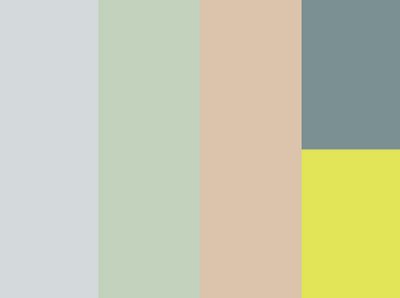
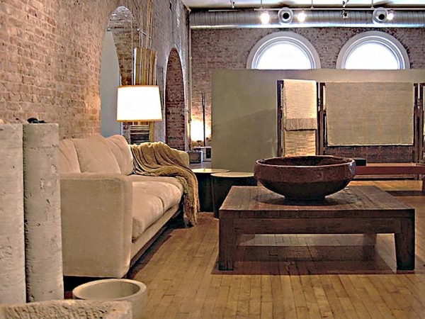
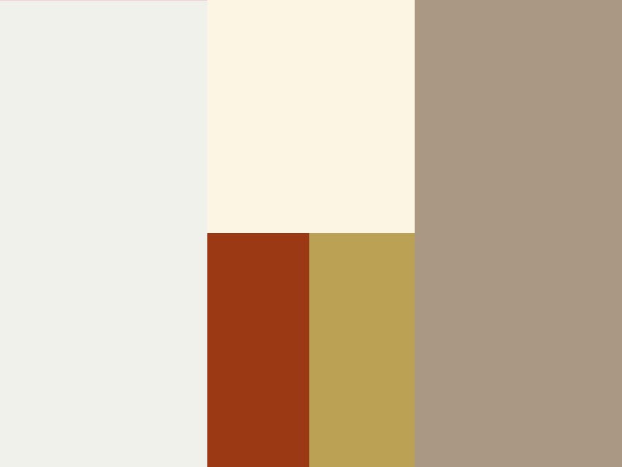
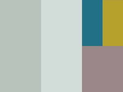
The color swatches are my tinkering with the colors from a recent outing. We can call it a color narrative. From left to right: Peri-Blue, Lino Green, Samarkand Rose, Cash Register Gray & Froggy Yellow.
These go far into the dusty muted colors of the Omega & Bloomsbury which I have been loving recently as opposed to the bright not unlike Easter colors of the Shanghaiese restaurant (I’m told if you are in the know it is referred to as Wu Cuisine which is the regional name in the classic tradition) It was last Friday evening and I was in Monterey Park. The restaurant was painted two colors that although at odds with each other somehow worked. The space felt soft, relaxed and fresh even with all the tables full and staff running about.
The industrial works at the lofty ceiling had been painted out a periwinkle blue which wrapped down the walls about three feet. Below the walls were soft lavender. The floors had an industrial dark gray green carpet and the benches in the waiting area were upholstered in mint green vinyl. White commercially laundered tablecloths were on round tables that were packed comfortably together. The colors help to set off the colors of our food like the orange of the pumpkin and glutinous rice cakes the pink of the shrimp and the bright green of the loofa.
On the walls, decoration, the tiered red and gold printed Chun Lian were hanging from the ceiling welcoming the Spring and there was an appropriate amount of beaded screens made out of some kind of faux raffia in bright orange and hot pink at the door openings, as if someone might have said about their placement, “They will visually screen the dining room but not make the space feel heavy.”
The standard-light-bulb-shaped-pendant fixtures were spaced out evenly on a grid pattern and the bright whiteness of the glow matched the rice cakes. The whole place had a delightfully non existent approach to “art” and in the toilet there was a surprising lack of granite of juxtaposed colors that seem to be favored in many of the restaurants that I have visited in Monterey Park.