
Archive for

Contrast will always be with us. It clarifies who we are; it helps us to realize the long view. It helps us to make our choices: I want this not that. Contrast is always part of the composition. It is the contrast that bands and drives into the fold similar view points and creates agreement of outlook of what is important and what is not important creating a sense of purpose and time. Of what is fashion and what is not fashion. Of what is style and what is not style. Of what is art and not art. Of beauty and what is not beauty. Most start with what is already accepted and then talk about it from there. To look at everything and wonder about it’s beauty is something else. But surely that is the point. It is all beauty. Gertrude Stein lectures:
“Of course it is beautiful but first all beauty in it is denied and then all the beauty of it is accepted. If every one were not so indolent they would realise that beauty is beauty even when it is irritating and stimulating not only when it is accepted and classic. Of course it is extremely difficult nothing more so than to remember back to its not being beautiful once it has become beautiful. This makes it so much more difficult to realise its beauty when the work is being refused and prevents every one from realising that they were convinced that beauty was denied, once the work is accepted. Automatically with the acceptance of the time-sense comes the recognition of the beauty and once the beauty is accepted the beauty never fails any one. Beginning again and again is a natural thing even when there is a series. Beginning again and again and again explaining composition and time is a natural thing. It is understood by this time that everything is the same except composition and time, composition and the time of the composition and the time in the composition.”
-Desk Sir Edward Maufe, 1925. Mahogany, camphor wood and ebony, gessoed and gillded with white gold; ivory and rock crystal; silk handles.
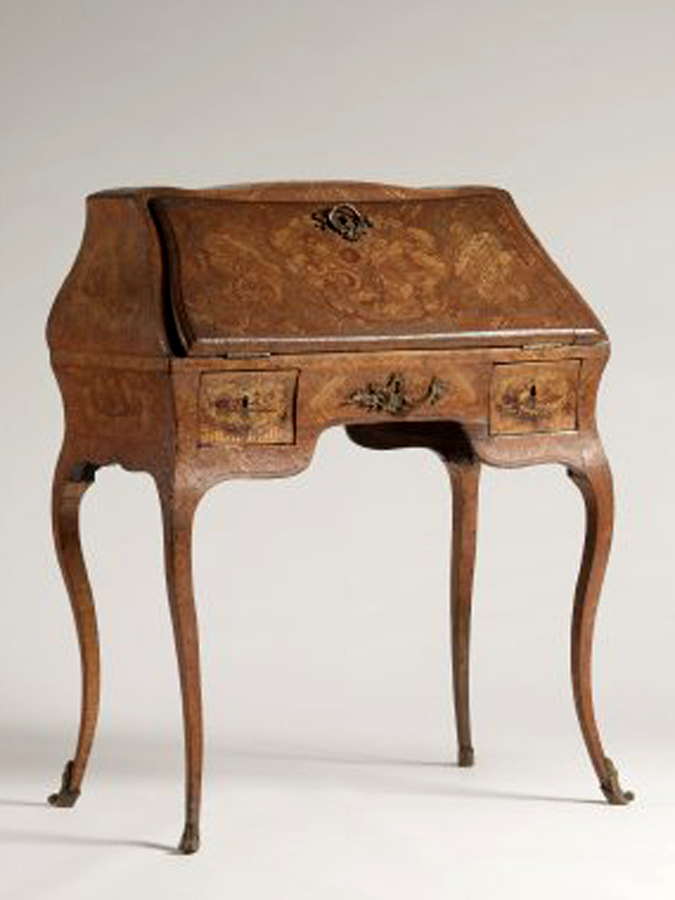
I am slowly starting to furnish my imaginary home. I’m not sure where I’ll place my new desk, but I had to get it. Bachelard in The Poetics of Space wrote something about that when we think of home, we have an idealized imaginary home in our minds, and if we try to leave this place to have it built, it moves into the area of a psychological project. Can’t you imagine running your fingers along my desk’s lovely curves? Opening a drawer for a paper clip? I think my little lap top fits nicely. I must find a chair, sit up straight, and not cross my legs.
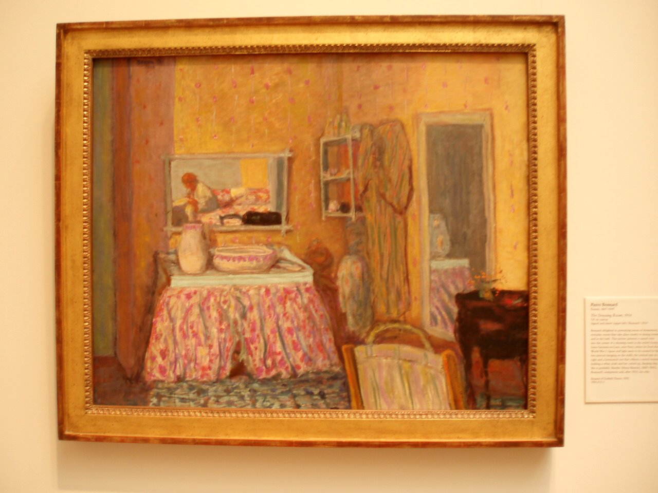
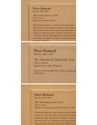
Desk, France, 18th century 1750-1775.
Gertrude 101: “Everybody gets so much information all day long that they lose their common sense.”
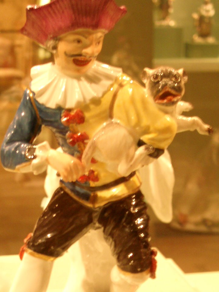 1740. Harlequin and Pug as Hurdy-Gurdy. His Face!
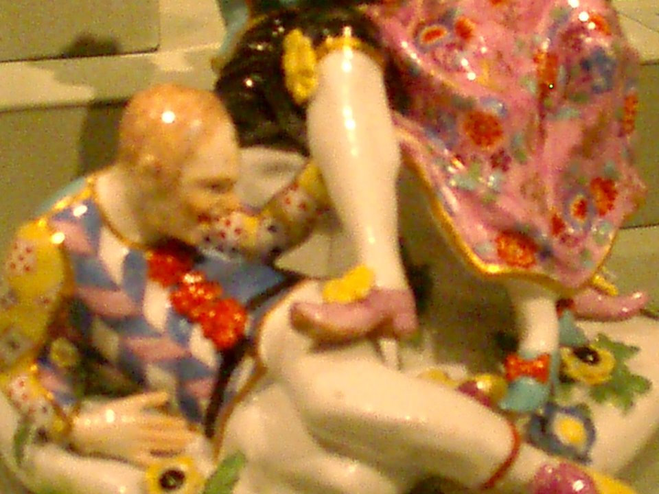
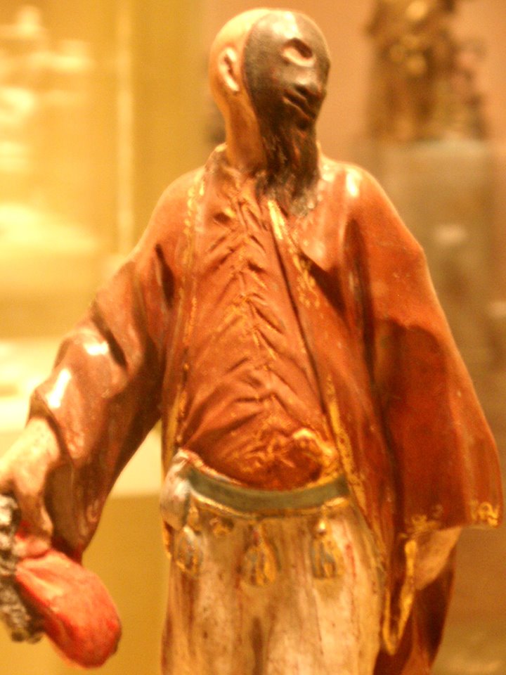
 c.1750 Italian. The Alchemist & his Assistant.
 Orientals with an Artichoke as a Perfume Burner. Model by Johann Friedrich Luck. German, Frankenthal, ca. 1766.
 Indiscreet Harlequin. Model 1740. The shoes!
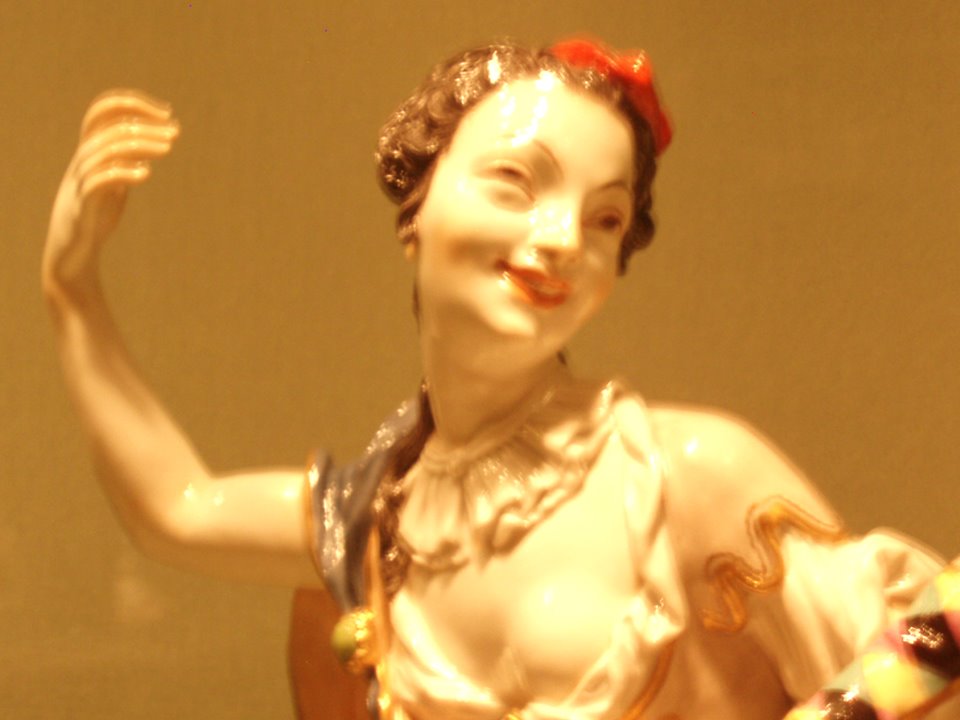 The Muse Thalia with Infant. Model after Johann Joachim Kändler (1706-1775).
 Pantaloon. Meissen. Böttger period. (1710-1719).
 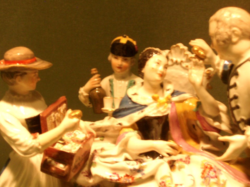 The Trinket Seller. Meissen. After a model 1738. Johann Joachim Kändler (1706-1775).
 After several years, Böttger finally figured out how to make a dark red colored porcelain-like material. A step in the right direction so they set up a factory in 1710. Johann had a bit of an epiphany around 1713 and tried making porcelain out of his hair powder which worked. Everyone was happy although I’m not sure what happenend to Johann.
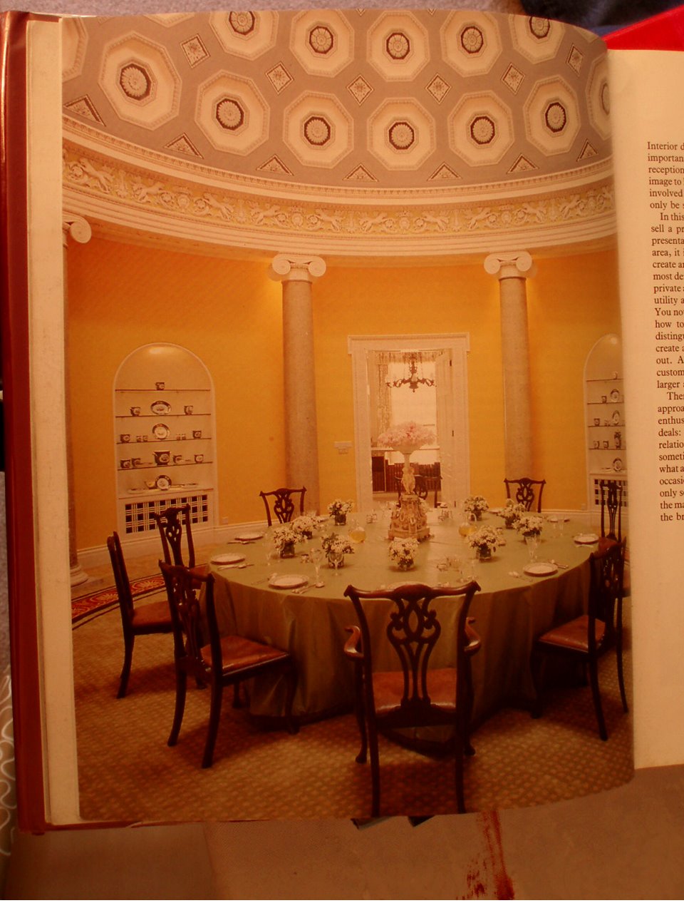 David Hicks: “The Duke & Duchess of Abercorn’s rotunda in Northern Ireland. Lit by a skylight, it has a magnificent coffered ceiling which I painted in three tones of grey. The background of the frieze was painted lettuce green to complement the scagliola columns. The circular carpet, designed to my specifications was made in the Far East.”
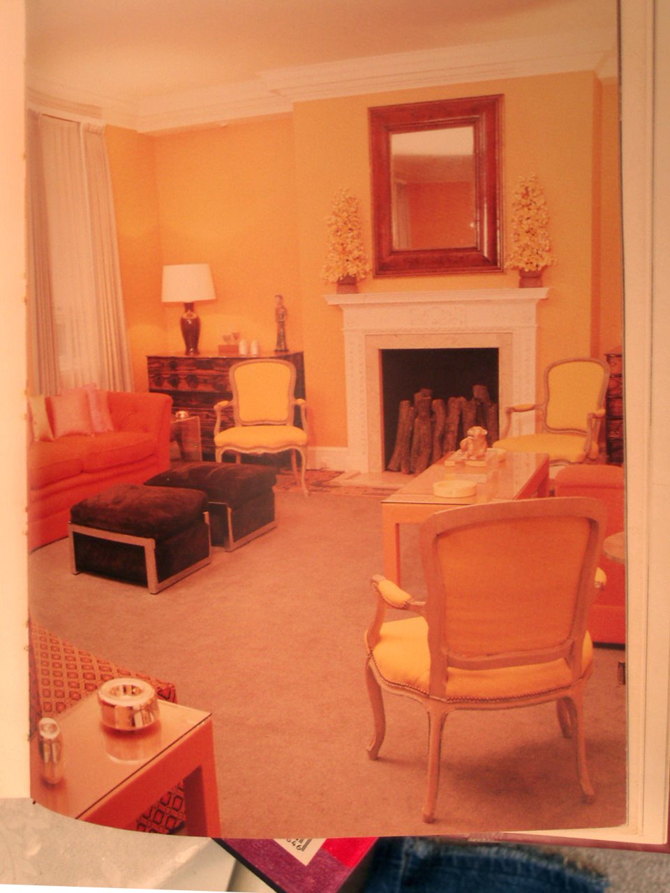
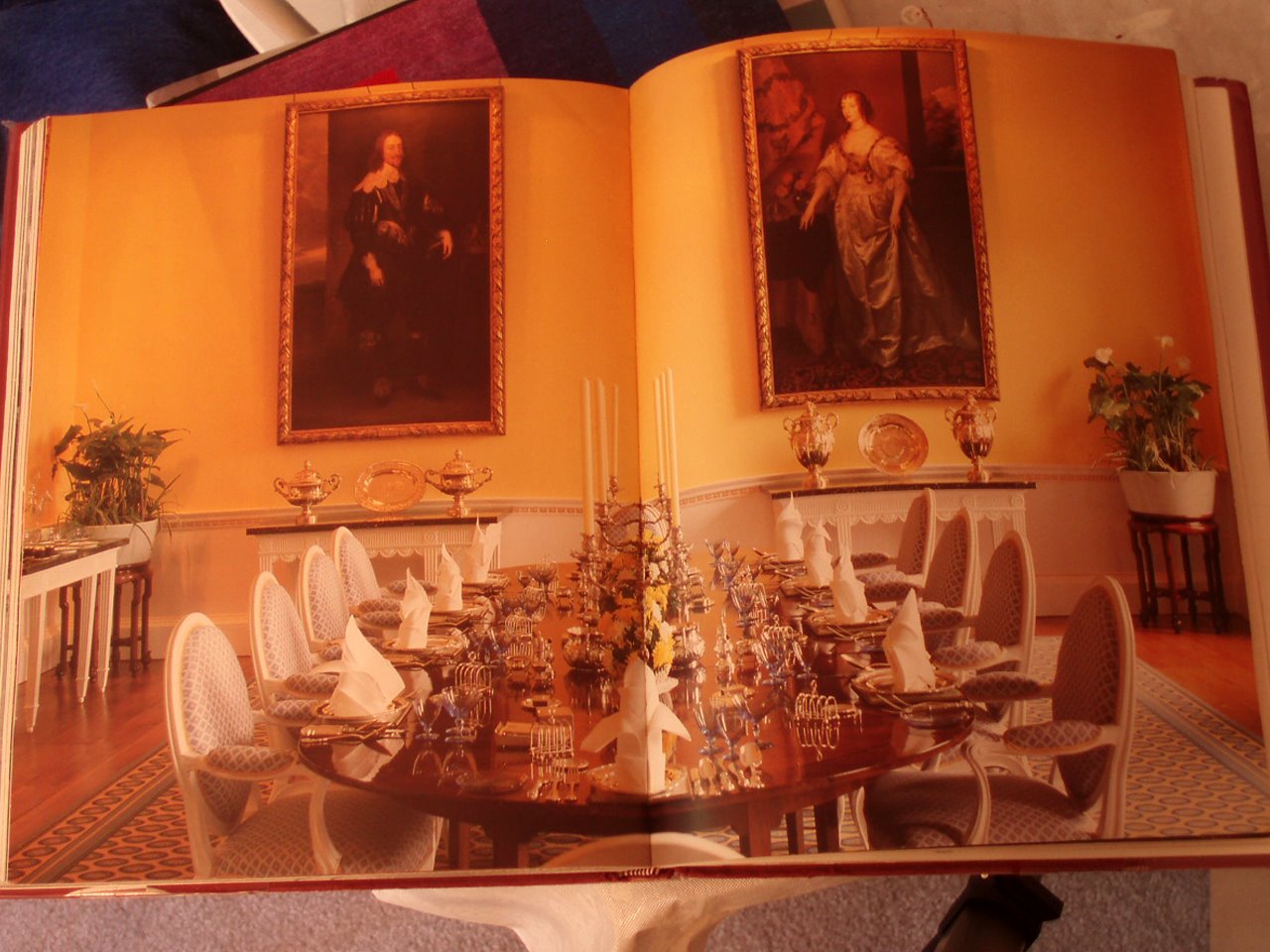 David Hicks: “The magnificent dining room at Broadlands has four full-length Van Dyck portraits. For my nephew and niece, I suggested a color scheme of daffodil yellow for the walls and deep Naples yellow for the background of the frieze, the details of which were then picked out in pure white.”
 A rooftop view towards the East 70’s.
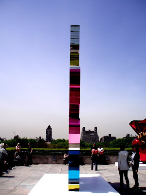 Jeff Koons, Coloring Book, 1997–2005. High chromium stainless steel with transparent color coating; 222 x 1311/2 x 9 1/8 in.
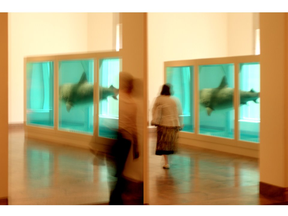 A double please. Hirst. The Physical Impossibility of Death in the Mind of Someone Living. The scum floating at the top of the tank was quite captivating.
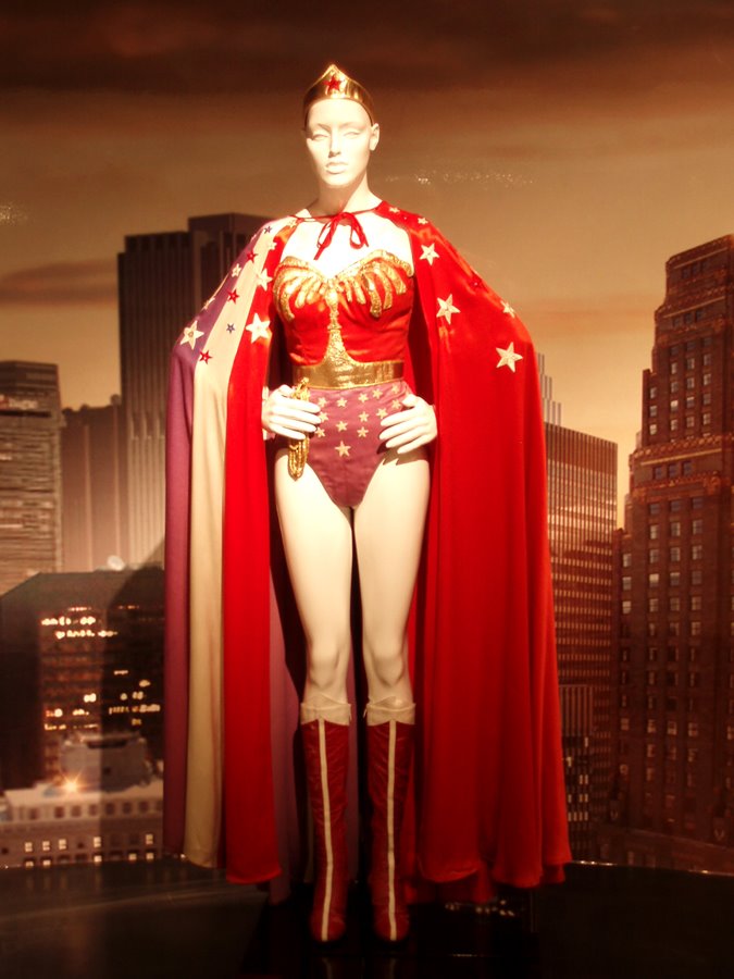 Linda Carter’s wonder woman costume surrounded by a chthonian darkness which I found surprising as she has always held a bright and special place in my heart. I really wanted to get a good look at her bullet proof cuffs.
A CUTLET. A blind agitation is manly and uttermost.
–Tender Buttons. Objects, 1914.
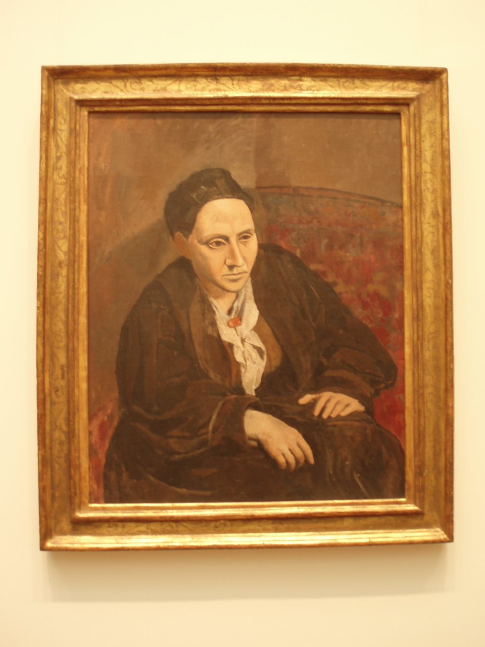
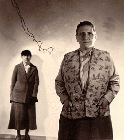
My friend Mr. RM of West Palm Beach once told me he thought that Alice B. wrote the Autobiography of Alice B. Toklas and not Gertrude Stein, as Stein’s works are incomprehensible and The Autobiography is not.
I’ve always enjoyed reading about authors rather than reading their work. Gertrude Stein was my first favorite person to read about. She said things of which I had never heard. “It takes a lot of time to be a genius, you have to sit around so much doing nothing, really doing nothing.” It thrilled me. This, Picasso’s portrait, was on the cover of one of my favorite biographies that I read in high school. I used to stare at the cover; imagining it. It became a symbol for me of, that which was beyond where I was, so when wandering through the MET ten years ago I came across the portrait, it surprised me. It was not unlike one of Thoreau’s deers in the woods.
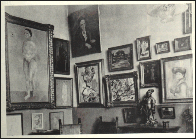
See portrait in situ here.
I still like to sport a Gertrude haircut and I still fantasize about having a suit made out of brown corduroy and taking up with socks and sandals for long walks around Paris (It is not what France gave you but what it did not take from you that was important). The title of this post is Stein. The rest of the quote is, “If you do not enjoy it, why do you make a fuss about it?” My new motto. You can hear the interview from 1934 here.

Years ago I wrote a short poem that ended, “a fabulous shade of puce.” I can’t find the poem, but it began, “I love it when life works” some unrequited reminiscing over a particular Canadian ballet dancer. Puce, 1787, from Fr. puce “flea,” It is the color of a flea. Perhaps more so the color of a smashed flea. I love the names of colors. Farrow & Ball named theirs, Passage Puce, after a David Hicks done staircase at Barons Court. Above, a short movie by Kenneth Anger, Puce Moment (1949).

