
Posts from the ‘color’ Category
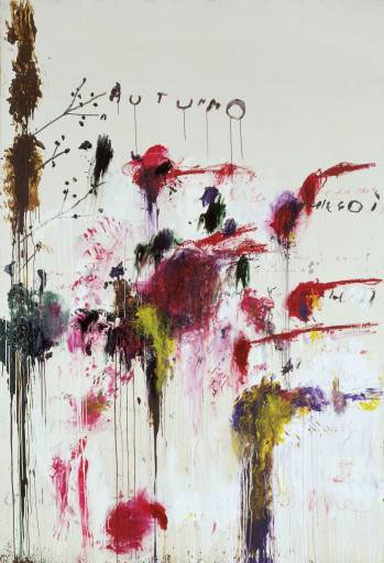

 5 year old Lily was my offical photographer while I was in Bellingham. These are some of my favorites.
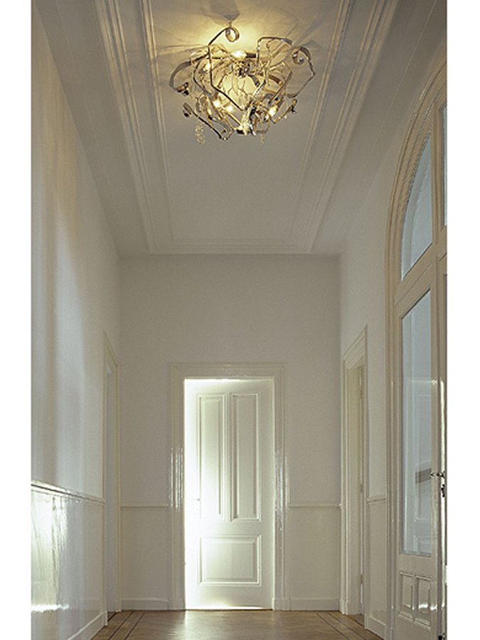 Hall, uncertain as to who or where I got this. I love it as an example of contrasts of paint finishes and subtlety. The glossy warmer white trim and panelling with the cooler flat of the wall.
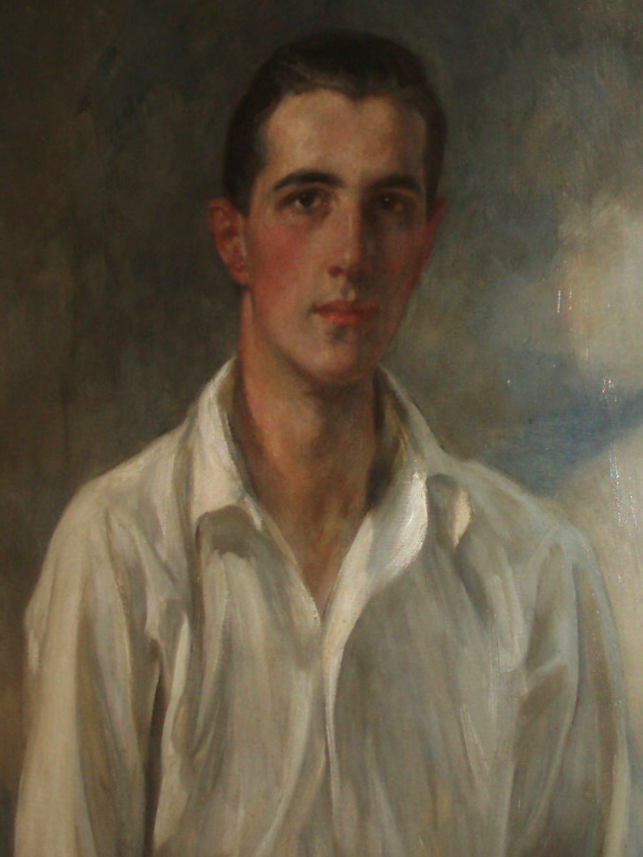
Again contrasts of white with the dark of the background the simplicity of a white shirt. Painting from Center 44, NYC.
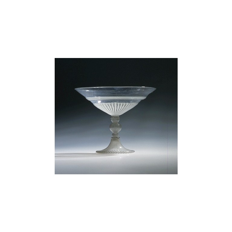 Tazza. Venice. Fillagree glass. 1550-1650. Dimensions: 4.75″ H x 6″ W. What perfect proportions.
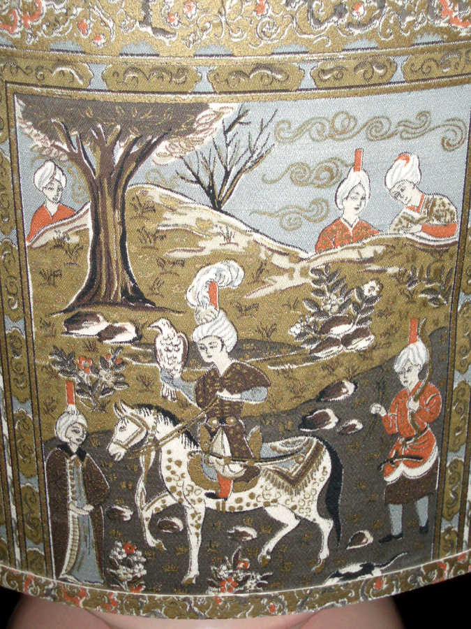
One of a pair. c 1940? I took the picture about a year ago in NYC at a shop on Bond Street. It had just arrived in and I never got the information on it.
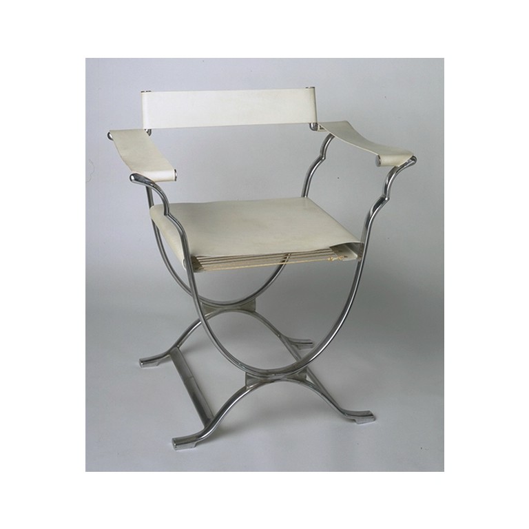 Roman Chair, 1933. By Sir Ambrose Heal, (1872-1959).
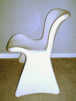 Fiberglass Chair. 1 of a pair. Black and White. These are mine, and I can’t find any information on them.
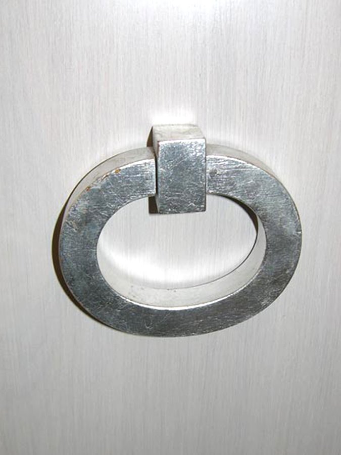
Handle from Dorthy Draper bureau. Wood and White Gold.
The connotations of white are quite easy to recognize, but lets remind ourselves: Purity, death, virtue, hope, cleanliness, healing, nothingness, being, peace, absence, good, surrender, horror and unity.
White things I love: Wall to wall bouclé, milk glass, handkerchief linen, porcelain figurines, Marston & Langinger paint color: Canvas
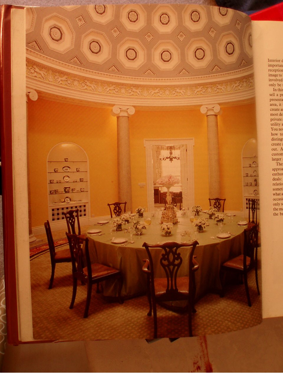 David Hicks: “The Duke & Duchess of Abercorn’s rotunda in Northern Ireland. Lit by a skylight, it has a magnificent coffered ceiling which I painted in three tones of grey. The background of the frieze was painted lettuce green to complement the scagliola columns. The circular carpet, designed to my specifications was made in the Far East.”
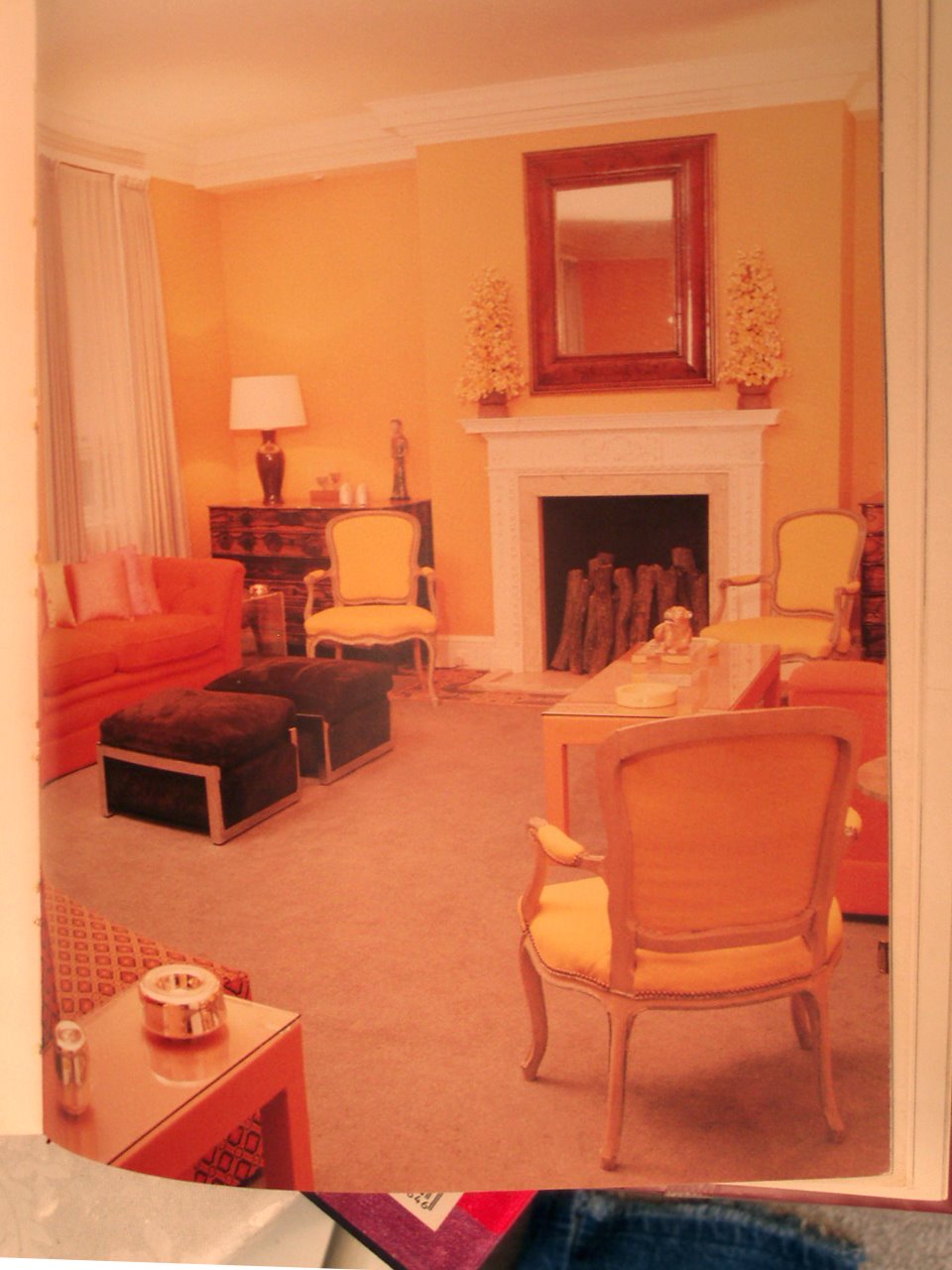
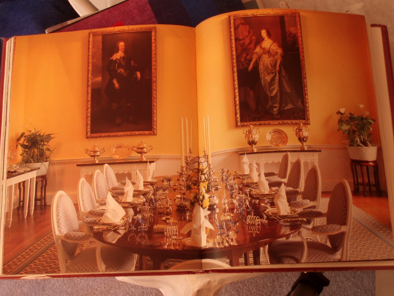 David Hicks: “The magnificent dining room at Broadlands has four full-length Van Dyck portraits. For my nephew and niece, I suggested a color scheme of daffodil yellow for the walls and deep Naples yellow for the background of the frieze, the details of which were then picked out in pure white.”
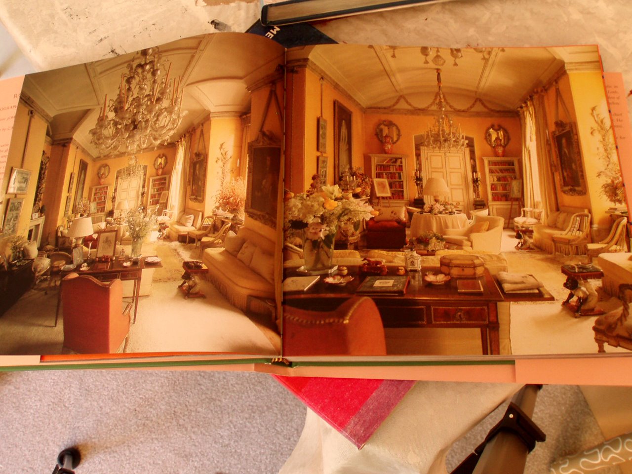
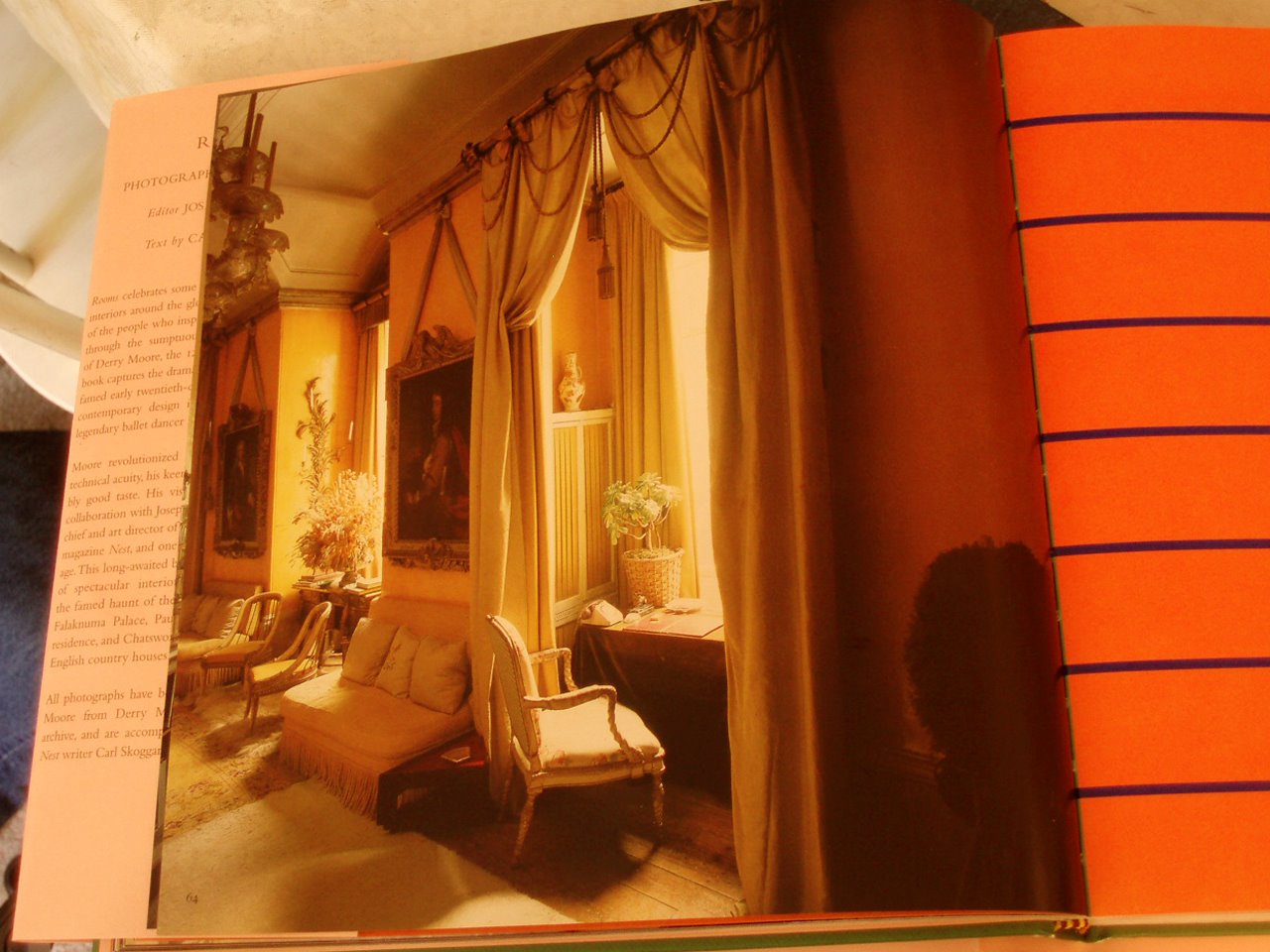

Years ago I wrote a short poem that ended, “a fabulous shade of puce.” I can’t find the poem, but it began, “I love it when life works” some unrequited reminiscing over a particular Canadian ballet dancer. Puce, 1787, from Fr. puce “flea,” It is the color of a flea. Perhaps more so the color of a smashed flea. I love the names of colors. Farrow & Ball named theirs, Passage Puce, after a David Hicks done staircase at Barons Court. Above, a short movie by Kenneth Anger, Puce Moment (1949).
1. 2.
2.
 3.
3.
 4.
4.
 5.
5.
 6.
6.
7.
8.
 9.
9.
10.
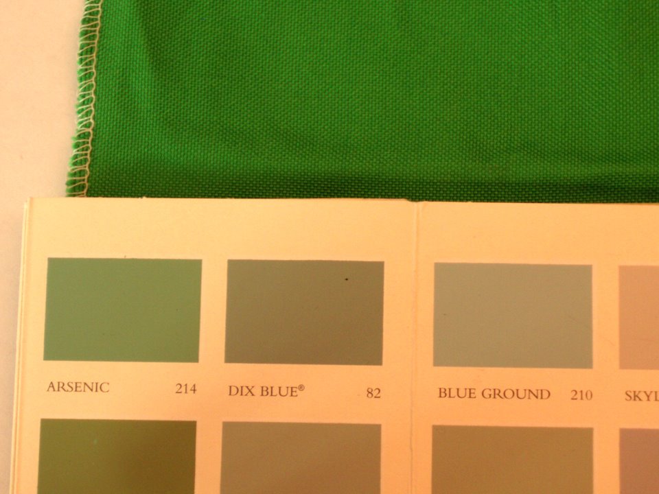
1. Farrow & Ball Arsenic my favorite color for the week–could be a fun play with Isaac Mizrahi’s “Extra silk” for S. Harris.
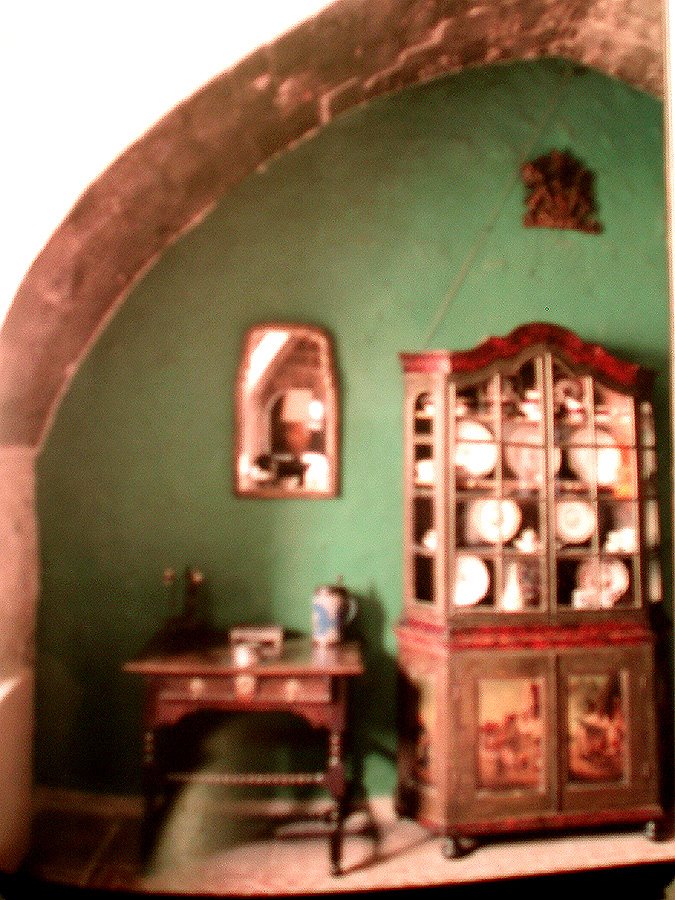
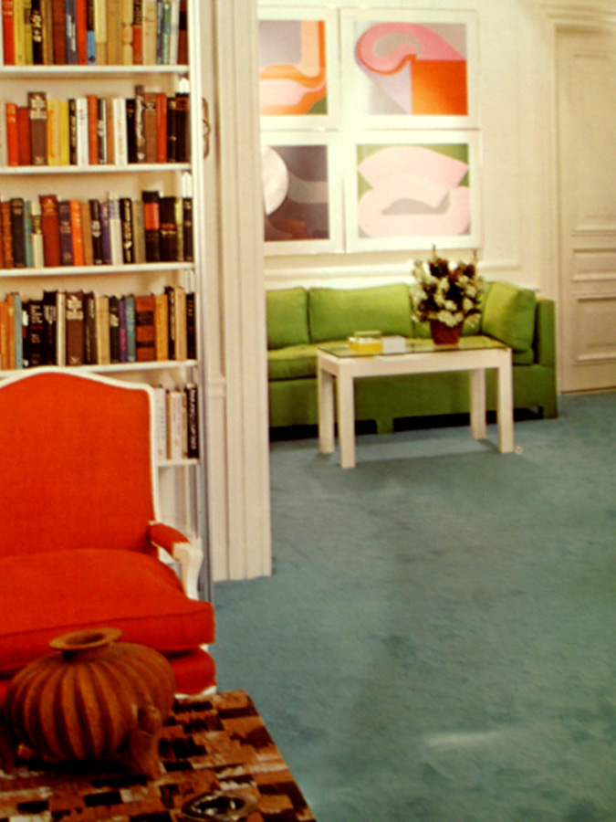
2. The dining room at Biddesden in Wiltshire. Lunch Green from from Farrow & Ball’s “Paint & Color in Decoration.” A must read for painting techniques & brushwork–something to study in our spray on orange peel on dry wall world.
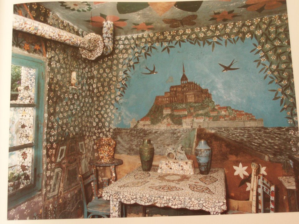
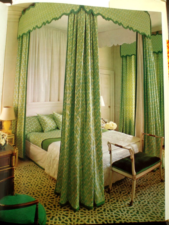
4. Teal greens in the mosaic work in Raymond Isidore’s, La Maison Pique-Assiette. Monsieur Isidore was for a while a caretaker of the Saint Cheron cemetery near Chartres. He began his life’s work embellishing his home and gardens in 1938 collecting bits of pottery and incorporating it into his interior–he completed it in 1962 then dying 2 years later.
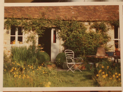
5. I rip things out, this inspiration for my future country garden.

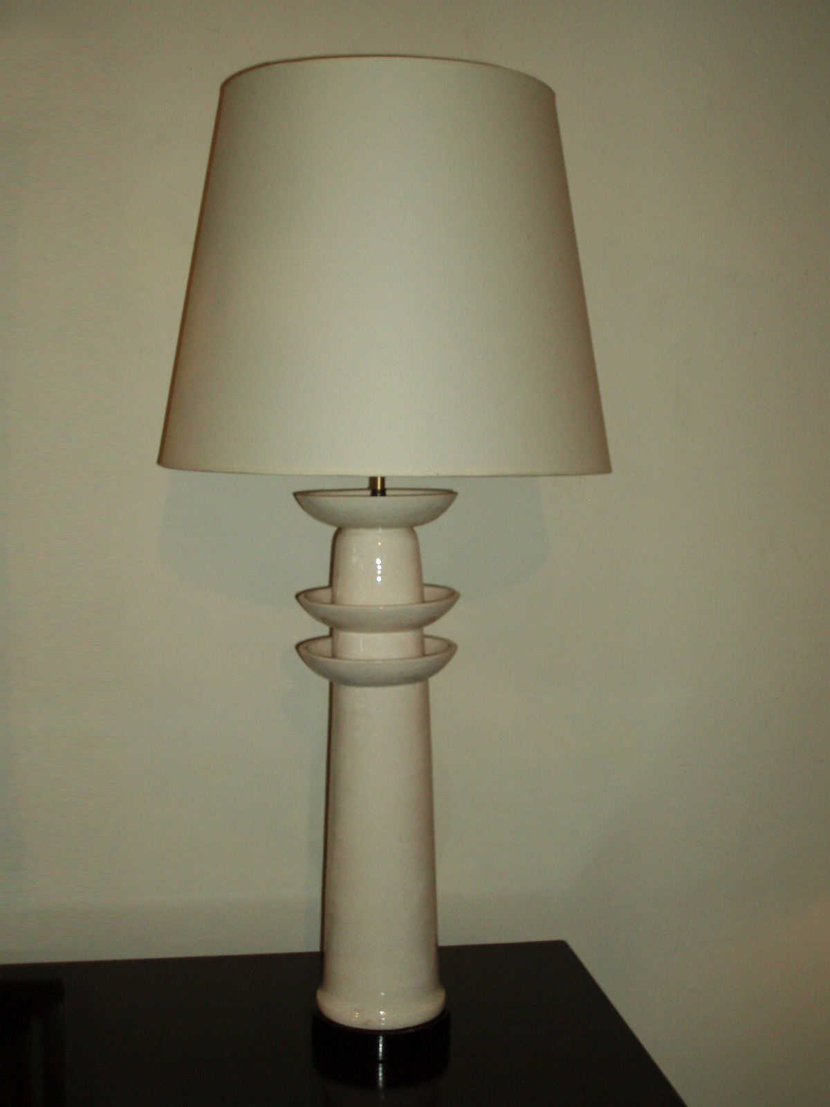
 At Rubish across from Lawson-Fenning in Silverlake. Rubish and the lamps have a fun feeling of what I like to imagine to be 5th Ave overlooking the park c 1980 (I’ve read Ms Wearstler is a fan). They also had a fabulous Karl Springer dark blue snakeskin games table which my shopping companion Michael wanted for Mahjong. Right in the area is LA Mill which is definately worth a visit for their coffee and atmosphere. The images on their website don’t really feature it.
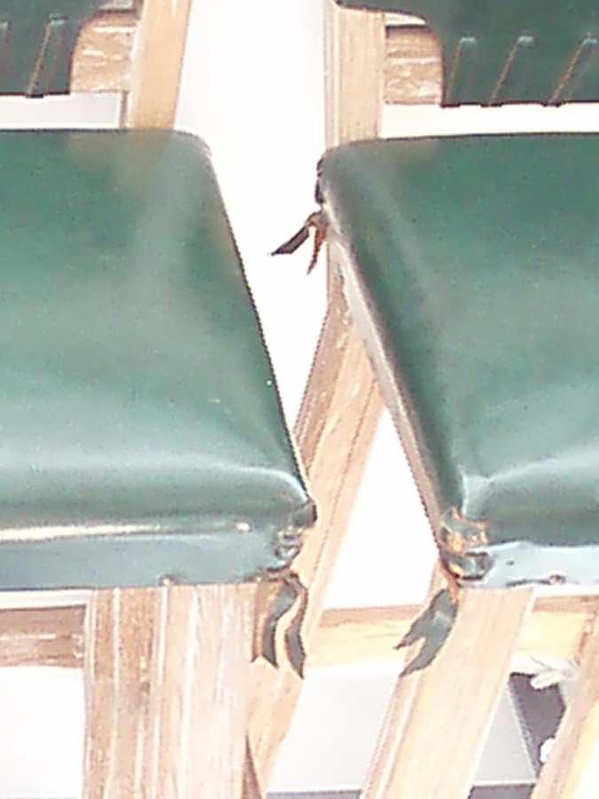
French 1940’s bar stools, beautiful green leather and details with cerused oak. At Orange in Los Angeles

